Statistical Graphics using lattice - Purdue...
72
Introduction Basic use Overview Case studies Statistical Graphics using lattice Deepayan Sarkar Fred Hutchinson Cancer Research Center 29 July 2008 Deepayan Sarkar Statistical Graphics using lattice
Transcript of Statistical Graphics using lattice - Purdue...
Introduction Basic use Overview Case studies
Statistical Graphics using lattice
Deepayan Sarkar
Fred Hutchinson Cancer Research Center
29 July 2008
Deepayan Sarkar Statistical Graphics using lattice
Introduction Basic use Overview Case studies
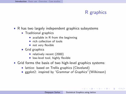
R graphics
� R has two largely independent graphics subsystems� Traditional graphics
� available in R from the beginning� rich collection of tools� not very flexible
� Grid graphics� relatively recent (2000)� low-level tool, highly flexible
� Grid forms the basis of two high-level graphics systems:� lattice: based on Trellis graphics (Cleveland)� ggplot2: inspired by“Grammar of Graphics” (Wilkinson)
Deepayan Sarkar Statistical Graphics using lattice
Introduction Basic use Overview Case studies
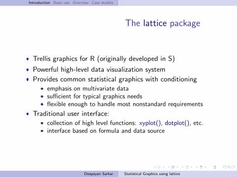
The lattice package
� Trellis graphics for R (originally developed in S)
� Powerful high-level data visualization system
� Provides common statistical graphics with conditioning� emphasis on multivariate data� sufficient for typical graphics needs� flexible enough to handle most nonstandard requirements
� Traditional user interface:� collection of high level functions: xyplot(), dotplot(), etc.� interface based on formula and data source
Deepayan Sarkar Statistical Graphics using lattice
Introduction Basic use Overview Case studies
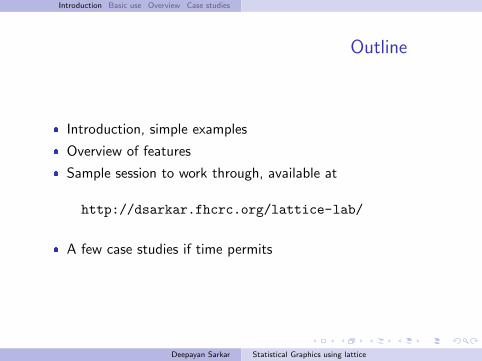
Outline
� Introduction, simple examples
� Overview of features
� Sample session to work through, available at
http://dsarkar.fhcrc.org/lattice-lab/
� A few case studies if time permits
Deepayan Sarkar Statistical Graphics using lattice
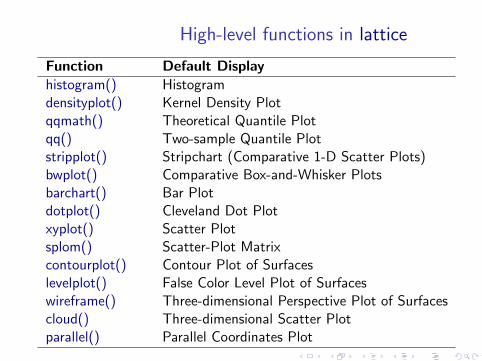
High-level functions in lattice
Function Default Displayhistogram() Histogramdensityplot() Kernel Density Plotqqmath() Theoretical Quantile Plotqq() Two-sample Quantile Plotstripplot() Stripchart (Comparative 1-D Scatter Plots)bwplot() Comparative Box-and-Whisker Plotsbarchart() Bar Plotdotplot() Cleveland Dot Plotxyplot() Scatter Plotsplom() Scatter-Plot Matrixcontourplot() Contour Plot of Surfaceslevelplot() False Color Level Plot of Surfaceswireframe() Three-dimensional Perspective Plot of Surfacescloud() Three-dimensional Scatter Plotparallel() Parallel Coordinates Plot
Introduction Basic use Overview Case studies Univariate Tables Scatter plots Shingles Object
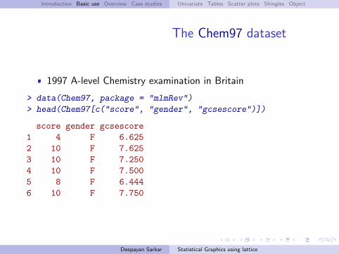
The Chem97 dataset
� 1997 A-level Chemistry examination in Britain
> data(Chem97, package = "mlmRev")
> head(Chem97[c("score", "gender", "gcsescore")])
score gender gcsescore1 4 F 6.6252 10 F 7.6253 10 F 7.2504 10 F 7.5005 8 F 6.4446 10 F 7.750
Deepayan Sarkar Statistical Graphics using lattice
Introduction Basic use Overview Case studies Univariate Tables Scatter plots Shingles Object
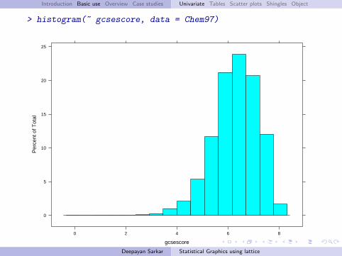
> histogram(~ gcsescore, data = Chem97)
gcsescore
Per
cent
of T
otal
0
5
10
15
20
25
0 2 4 6 8
Deepayan Sarkar Statistical Graphics using lattice
Introduction Basic use Overview Case studies Univariate Tables Scatter plots Shingles Object
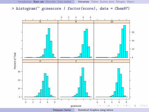
> histogram(~ gcsescore | factor(score), data = Chem97)
gcsescore
Per
cent
of T
otal
0
10
20
30
0 2 4 6 8
0 2
0 2 4 6 8
4
6
0 2 4 6 8
8
0
10
20
30
10
Deepayan Sarkar Statistical Graphics using lattice
Introduction Basic use Overview Case studies Univariate Tables Scatter plots Shingles Object
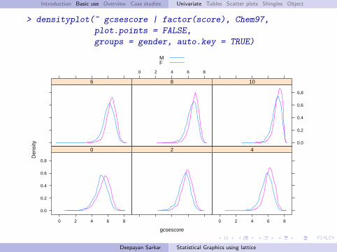
> densityplot(~ gcsescore | factor(score), Chem97,
plot.points = FALSE,
groups = gender, auto.key = TRUE)
gcsescore
Den
sity
0.0
0.2
0.4
0.6
0.8
0 2 4 6 8
0 2
0 2 4 6 8
4
6
0 2 4 6 8
8
0.0
0.2
0.4
0.6
0.8
10
MF
Deepayan Sarkar Statistical Graphics using lattice

Introduction Basic use Overview Case studies Univariate Tables Scatter plots Shingles Object
Trellis Philosophy: Part I
� Display specified in terms of� Type of display (histogram, densityplot, etc.)� Variables with specific roles
� Typical roles for variables� Primary variables: used for the main graphical display� Conditioning variables: used to divide into subgroups and
juxtapose (multipanel conditioning)� Grouping variable: divide into subgroups and superpose
� Primary interface: high-level functions� Each function corresponds to a display type� Specification of roles depends on display type
� Usually specified through the formula and the groups argument
Deepayan Sarkar Statistical Graphics using lattice
Introduction Basic use Overview Case studies Univariate Tables Scatter plots Shingles Object
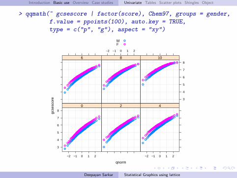
> qqmath(~ gcsescore | factor(score), Chem97, groups = gender,
f.value = ppoints(100), auto.key = TRUE,
type = c("p", "g"), aspect = "xy")
qnorm
gcse
scor
e
3
4
5
6
7
8
−2 −1 0 1 2
●
●●●●
●●●●●
●●●●●●●●●●
●●●●●●●●●●●
●●●●●●●●●●●●●●●●●●●●
●●●●●●●●●●●●●●●●●●●
●●●●●●●●●●●●●
●●●●●●●●●
●●●●●●●
●
●
●●●
●●●●●
●●●●●●●
●●●●●●●●●●●●●
●●●●●●●●●●●●●●
●●●●●●●●●●●●●●●●●●●●●
●●●●●●●●●●●●●●●●●●●
●●●●●●●●●●
●●●●●
●●
0
●
●●●●
●●●●●●
●●●●●●●●●●●●
●●●●●●●●●●●●●●●●
●●●●●●●●●●●●●●●●●
●●●●●●●●●●●●●●●●●●●●●
●●●●●●●●●●●●●●
●●●●●●
●●●
●●●●
●●●●●●
●●●●●●●●●●●●
●●●●●●●●●●●●●●●
●●●●●●●●●●●●●●●●●●●●●●●
●●●●●●●●●●●●●●●●●●●
●●●●●●●●●●●●
●●●●●●●●
●
2
−2 −1 0 1 2
●
●●●●
●●●●●●
●●●●●●●●●●●●●●●●
●●●●●●●●●●●●●●●●
●●●●●●●●●●●●●●●●●●●●
●●●●●●●●●●●●●●●●●●
●●●●●●●●●●●●
●●●●●●
●
●
●●●●●
●●●●●●●●
●●●●●●●●●●●●
●●●●●●●●●●●●●●●●●●●●●●●●●●●
●●●●●●●●●●●●●●●●●●●
●●●●●●●●●●●●●●●
●●●●●●●●●●●●
●
4
●
●●●●
●●●●●●●●
●●●●●●●●●●●●
●●●●●●●●●●●●●●●●●●●
●●●●●●●●●●●●●●●●●●●●●●
●●●●●●●●●●●●●●●●
●●●●●●●●●●●●●
●●●●●
●●
●●●●●●
●●●●●●●●●●●
●●●●●●●●●●●●●●●●●●●●●
●●●●●●●●●●●●●●●●●●●●●●●●
●●●●●●●●●●●●●●●●●●●●●●●●
●●●●●●●●●
●●●
6
−2 −1 0 1 2
●
●●●●
●●●●●●●●●●
●●●●●●●●●●●●●●●●●
●●●●●●●●●●●●●●●●●●
●●●●●●●●●●●●●●●●●●●
●●●●●●●●●●●●●●●●●●●
●●●●●●●●●
●●●
●
●●●●●
●●●●●●●●●
●●●●●●●●●●●●●●●
●●●●●●●●●●●●●●●●●●●●●
●●●●●●●●●●●●●●●●●●●●●●●●●●●●●●●
●●●●●●●●●●●●●
●●●● ●
8
3
4
5
6
7
8
●
●●●●●
●●●●●●●
●●●●●●●●●●●●
●●●●●●●●●●●●●●●●●●●●●●●
●●●●●●●●●●●●●●●●●●●●●●●●
●●●●●●●●●●●●●●●●●●
●●●●●●●●● ●
●
●●●●●●●
●●●●●●●●●●●
●●●●●●●●●●●●●●●●●●●●●
●●●●●●●●●●●●●●●●●●●●●●●●●
●●●●●●●●●●●●●●●●●●●●●●●●●●●●
●●●●●● ●
10
MF
●
●
Deepayan Sarkar Statistical Graphics using lattice
Introduction Basic use Overview Case studies Univariate Tables Scatter plots Shingles Object
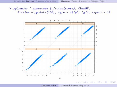
> qq(gender ~ gcsescore | factor(score), Chem97,
f.value = ppoints(100), type = c("p", "g"), aspect = 1)
M
F
3
4
5
6
7
8
3 4 5 6 7 8
●
●●●
●●●●●●
●●●●●●●
●●●●●●●●●●●●
●●●●●●●●●●●●●●●●●●●●●●●●●●●●●●●●●●
●●●●●●●●●●●●●●●●●
●●●●●●●●●●●
●●●●●●
●●
●
0
●
●●●●●●●●●●●●
●●●●●●●●●●●
●●●●●●●●●●●●●●●●●●●
●●●●●●●●●●●●●●●●●●●●●●●
●●●●●●●●●●●●●●●●●●●●●●●●●
●●●●●●●●
●
2
3 4 5 6 7 8
●
●●
●●●●●●●●●●●●●●●●●
●●●●●●●●●●●●●●●●●●●●
●●●●●●●●●●●●●●●●●●●●●●●●
●●●●●●●●●●●●●●●●
●●●●●●●●●●●●●●●
●●●●
●
4
●
●●●●●●●●●
●●●●●●●●●●●●●●●●●●●●
●●●●●●●●●●●●●●●●●●●●●●●●●●●●●
●●●●●●●●●●●●●●●●●●●●
●●●●●●●●●●●●●●●●●●●
●●
6
3 4 5 6 7 8
●
●●●●●
●●●●●●●●●
●●●●●●●●●●●●●●●●●●●●●●●●●●
●●●●●●●●●●●●●●●●●●●●●●●●●●●●●
●●●●●●●●●●●●●●●●●●●●
●●●●●●●●
●●
8
3
4
5
6
7
8
●
●●●●●●●●●●
●●●●●●●●●●●●●●●●●●●●●●●●●●●●●
●●●●●●●●●●●●●●●●●●●●●●●●●
●●●●●●●●●●●●●●●●●●●●●●●●●●
●●●●●●●●●
10
Deepayan Sarkar Statistical Graphics using lattice
Introduction Basic use Overview Case studies Univariate Tables Scatter plots Shingles Object
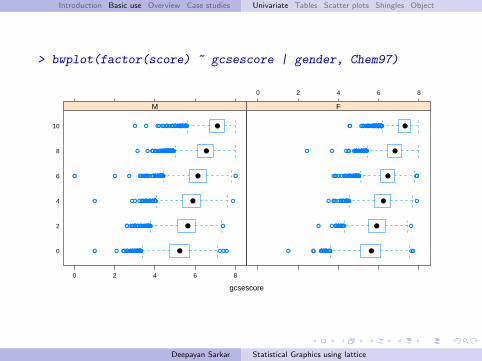
> bwplot(factor(score) ~ gcsescore | gender, Chem97)
gcsescore
0
2
4
6
8
10
0 2 4 6 8
●
●
●
●
●
●
●●● ● ●●●● ●●●● ● ●●● ●●●● ●●●● ●●●●● ●● ●●●●●● ● ●● ●●●● ●●●
● ● ● ●● ●●●● ●●●●●●●●●● ●●●●●●●● ●●●● ●●● ●●● ● ●
●● ●●● ● ●● ●●● ● ●●● ●●●●●●●●● ●●●●● ●● ●●●●●●● ●●
● ●●● ●●● ●● ●● ●● ●●●● ●●● ●● ●●● ●●● ● ●● ●●●●● ●● ●●●●●● ●●●● ●●●● ●●● ●●●● ●● ●●
● ●●●● ●●● ●● ● ●●●●● ●● ●● ●● ●●● ●●●●●● ●●● ●●● ●●● ●●●● ●● ●●●●● ●●● ●●● ●● ●● ●●● ●● ●●● ●●●●● ●●●
● ●●● ●●●● ● ●●● ●●●●●●●●● ●● ●● ●● ●● ● ●●● ●●●● ●● ●●● ●●● ●●● ●●●●●●
M
0 2 4 6 8
●
●
●
●
●
●
● ●●● ●●●●●●●●● ●● ●● ●●● ● ●●● ● ●
●●●● ●● ●● ●●●● ●●● ●●● ●● ●● ●
●●● ●●● ●● ● ●●●●●● ●●● ● ●●●●● ●●●●
●● ●● ●●●● ●● ●●●● ●●● ●●● ●●●● ● ●●●●● ●● ●●● ●●● ●●●● ● ●●●● ● ●●●●● ●● ●●● ●
●● ●●● ●● ●● ●●●●●● ●●●● ● ●● ●●●●● ●● ●● ●●● ●● ●● ● ●●●● ●●●● ●●●● ●●
●●●●● ●●● ● ●●●●●●●● ● ●●●●● ●●●● ●●●●● ●● ● ●● ●●●●●●●● ●●●●●●● ●●● ●●●● ●● ●●●● ●● ●● ●●●● ●●●●●●●● ●
F
Deepayan Sarkar Statistical Graphics using lattice
Introduction Basic use Overview Case studies Univariate Tables Scatter plots Shingles Object
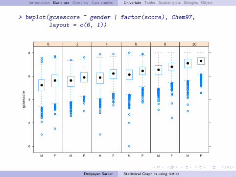
> bwplot(gcsescore ~ gender | factor(score), Chem97,
layout = c(6, 1))gc
sesc
ore
0
2
4
6
8
M F
●
●
●●
●
●
●
●●
●
●
●●
●
●
●●
●
●
●●●
●●
●●
●●●
●
●
●●
●
●●●
●●
●
●
●
●
●●
●
●●
●
●
●●
●
●●●●●●●●
●
●●
●
●
●●●
●●
●
●
●
●
0
M F
●●
●
●
●
●
●
●●●
●
●●●●
●●●●●●
●●●●●
●
●●
●
●●
●
●
●●
●
●
●
●
●●●●●
●
●
●
●
●●●●●●●
●●
●
●
●
●●
●
2
M F
●
●
●
●
●
●
●
●
●
●
●●
●
●
●●●
●●●●●●
●●●
●
●●●
●
●
●
●●●●●
●●
●●
●
●●
●
●
●
●
●
●
●●●●●
●
●●
●
●
●
●●
●
●
●●●●
4
M F
●
●
●
●●
●
●●
●
●
●
●
●
●
●
●●●
●
●●
●
●
●
●●●
●
●●
●
●
●
●●
●
●
●
●
●
●●●●●●
●
●●●●●●●
●
●●
●●
●
●
●
●
●●
●
●
●
●
●●●
●
●
●
●
●
●
●
●●
●
●●
●
●
●
●●
●
●●●●
●
●●
●●●●●
●
●●●
●
●
●
●●
●
●
●
●●
●●
●
●
●●
●
●
6
M F
●●
●
●●●●
●●
●
●
●
●
●●●
●●●●●
●
●
●
●●
●
●●
●●
●
●
●●
●
●
●●
●
●●
●●
●
●
●
●
●●●
●
●
●●●
●●
●●
●
●●
●●
●
●
●
●●●
●
●●●●
●●●
●
●
●●
●
●
●
●
●
●●●●●
●
●●
●
●
●
●●
●●●●
●
●
●●●
●●
●
●
●
●
●
●
●●
●●
●●●
●
●●●
●
●
●
8
M F
●●
●
●●
●
●
●●
●
●
●
●
●
●●●●●●●
●
●
●●
●
●
●
●
●
●
●
●●
●
●
●
●
●
●
●
●
●●
●●●●●
●
●
●●●●
●
●●●●
●
●
●●
●
●●●●●●●
●
●●●●●●
●
●●
●
●●
●●●
●
●
●
●
●
●●●●●●
●
●
●●●●●●
●
●●
●
●
●
●●
●●
●
●●
●
●
●
●
●
●
●
●●
●●●●●
●●●
●
10
Deepayan Sarkar Statistical Graphics using lattice
Introduction Basic use Overview Case studies Univariate Tables Scatter plots Shingles Object
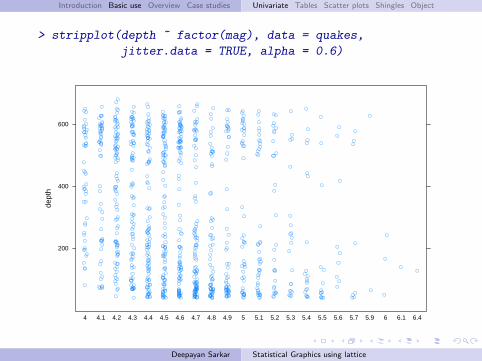
> stripplot(depth ~ factor(mag), data = quakes,
jitter.data = TRUE, alpha = 0.6)de
pth
200
400
600
4 4.1 4.2 4.3 4.4 4.5 4.6 4.7 4.8 4.9 5 5.1 5.2 5.3 5.4 5.5 5.6 5.7 5.9 6 6.1 6.4
Deepayan Sarkar Statistical Graphics using lattice
Introduction Basic use Overview Case studies Univariate Tables Scatter plots Shingles Object
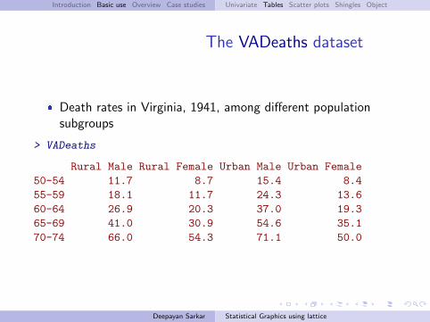
The VADeaths dataset
� Death rates in Virginia, 1941, among different populationsubgroups
> VADeaths
Rural Male Rural Female Urban Male Urban Female50-54 11.7 8.7 15.4 8.455-59 18.1 11.7 24.3 13.660-64 26.9 20.3 37.0 19.365-69 41.0 30.9 54.6 35.170-74 66.0 54.3 71.1 50.0
Deepayan Sarkar Statistical Graphics using lattice
Introduction Basic use Overview Case studies Univariate Tables Scatter plots Shingles Object
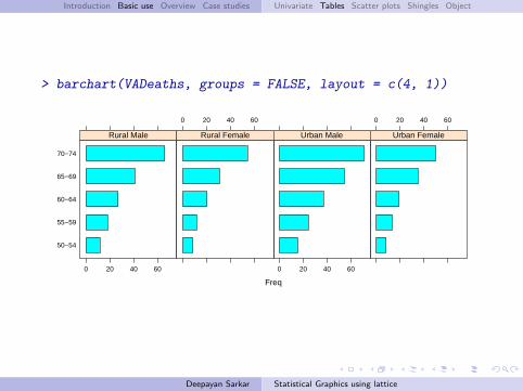
> barchart(VADeaths, groups = FALSE, layout = c(4, 1))
Freq
50−54
55−59
60−64
65−69
70−74
0 20 40 60
Rural Male
0 20 40 60
Rural Female
0 20 40 60
Urban Male
0 20 40 60
Urban Female
Deepayan Sarkar Statistical Graphics using lattice
Introduction Basic use Overview Case studies Univariate Tables Scatter plots Shingles Object
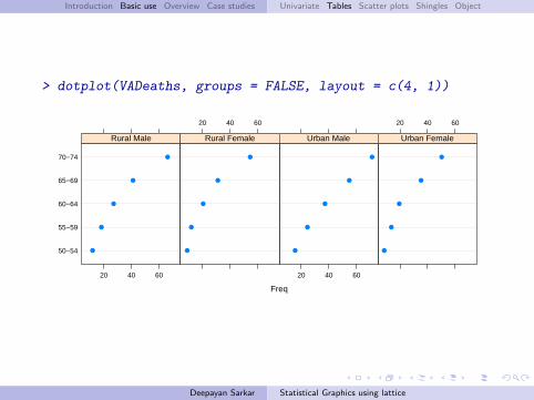
> dotplot(VADeaths, groups = FALSE, layout = c(4, 1))
Freq
50−54
55−59
60−64
65−69
70−74
20 40 60
●
●
●
●
●
Rural Male
20 40 60
●
●
●
●
●
Rural Female
20 40 60
●
●
●
●
●
Urban Male
20 40 60
●
●
●
●
●
Urban Female
Deepayan Sarkar Statistical Graphics using lattice
Introduction Basic use Overview Case studies Univariate Tables Scatter plots Shingles Object
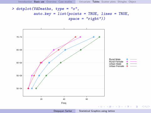
> dotplot(VADeaths, type = "o",
auto.key = list(points = TRUE, lines = TRUE,
space = "right"))
Freq
50−54
55−59
60−64
65−69
70−74
20 40 60
●
●
●
●
●
●
●
●
●
●
●
●
●
●
●
●
●
●
●
●
Rural MaleRural FemaleUrban MaleUrban Female
●
●
●
●
Deepayan Sarkar Statistical Graphics using lattice
Introduction Basic use Overview Case studies Univariate Tables Scatter plots Shingles Object
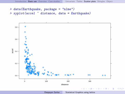
> data(Earthquake, package = "nlme")
> xyplot(accel ~ distance, data = Earthquake)
distance
acce
l
0.0
0.2
0.4
0.6
0.8
0 100 200 300
●●
●
●
●
●
●
●
●
●
●
●
●●
●●
●
●
●
●
●
●
●●
●
●
●
●
●●
●●
●
●●
●
●
●●●
●●
●
●●
●●●
● ●
●
●
●
●●
●
●
●●
●
●
●
●
●
●
●●●
●●
● ● ●
●
●
●●
●
●●
●
●
●●
●
●
●
●
●
●
● ● ●
●
●
●
●
●
●
●
●
●
●
●
●
●
●●
●
●●
●
●
●
●
●
●
●
●
●●●●
●
●
●
●
●
●●
●●
●
●
● ●
●
●
● ● ● ● ●
●
●
●
●●
●
●
●
●
●
●
● ●
●
●●
●●● ● ●●
●
●
●
●
●●
● ● ● ● ●
●
●
●●
● ●
Deepayan Sarkar Statistical Graphics using lattice
Introduction Basic use Overview Case studies Univariate Tables Scatter plots Shingles Object
> xyplot(accel ~ distance, data = Earthquake,
scales = list(log = TRUE),
type = c("p", "g", "smooth"))
distance
acce
l
10^−2.5
10^−2.0
10^−1.5
10^−1.0
10^−0.5
10^0.0
10^0.0 10^0.5 10^1.0 10^1.5 10^2.0 10^2.5
● ●●
●
●
●
●
●
●
●
●
●
● ●
●●
●
●
●
●
●
●
●●
●
●●
●
●
●
●●
●
●●
●
●
●●
●
●
●
●
●●
●
●
●
● ●
●
●
●
●
●
●
●
●
●
●
●
●
●
●
●
● ● ●
●●
●● ●
●
●
●●
●
●●
●
●
●●
●
●
●●
●
●
●
●
●
●
●
●
●
●
●
●
●
●●
●
●
●
●●
●
●●
●
●
●●
●
●
●
●
● ●●●
●
●
●
●
●
●●
●
●
●
●
●
●
●
●
●
●●
●
●
●
●
●
●●
●
●
●
●
●
●
● ●
●
●
●
●●●
●●
●
●
●
●
●
●●
●
●
●
●●
●
●
●
●
● ●
Deepayan Sarkar Statistical Graphics using lattice
Introduction Basic use Overview Case studies Univariate Tables Scatter plots Shingles Object
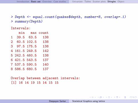
> Depth <- equal.count(quakes$depth, number=8, overlap=.1)
> summary(Depth)
Intervals:min max count
1 39.5 63.5 1382 60.5 102.5 1383 97.5 175.5 1384 161.5 249.5 1425 242.5 460.5 1386 421.5 543.5 1377 537.5 590.5 1408 586.5 680.5 137
Overlap between adjacent intervals:[1] 16 14 19 15 14 15 15
Deepayan Sarkar Statistical Graphics using lattice
Introduction Basic use Overview Case studies Univariate Tables Scatter plots Shingles Object
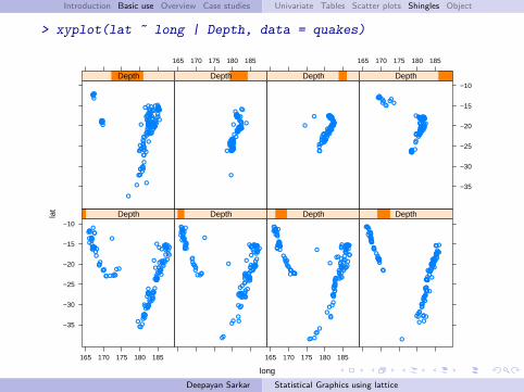
> xyplot(lat ~ long | Depth, data = quakes)
long
lat
−35
−30
−25
−20
−15
−10
165 170 175 180 185
●
●
● ●
●
●
●
●
●
●
●
●
●
● ●
●
●
●●●
●
●
●●
●
●
●
●
●●●●●●
●
●
●
●
●
●●
●
●●
●
●●
●
●
●●
●
●
●
●
●
●
●
●●●
●
●
●
●●
●●
●
●●● ●
●
●
●●
●
●
●
●●
●
●
●
●
●
●
●
●
●●●
●
●
●
●
●
●
●
●
●
●
●●
●
●
●
●
●● ●
●
●
●
●
●
●
●
●
●
●
●
●
●●
●
●
●●
●●
●
●●
●
●●
Depth
●
●●
●●●
●
●
●
●
●●
●
●
●
●
●
●
●
●
●
●
●
●
●
●
●
●
●●
●●
●
●
●●●●●●●●
●
●
●
●
●
●●
●
●
●
●
●
●
●
●
●
●
●
●
●●●●●
●
●●●●
●
●
●
●
●
●
●
●●
●
●●
●
●
●
●
●
●
●
●●
●
●
●
●
● ●
●
●●
●
●
●
●
●
●●
●●
●●●●
●
●
●
●
●
●●
●
●
●
●
●
●
●
●
●
●
●
●
●●
●●
●
Depth
165 170 175 180 185
●
●
●
●
●
●
●
●●
●
●
●
●
●
●
●
●
●
●
●
●
●
●
●
●●
●
●
●
●
●
●
●●
●
●
●
●
●
●
●
●
●
●
●
●●●
●
●
●
●●
●
●
●●
●
●
●
●
●
●
●
●
●
●
●
●
●
●
●
●
●
●
●
●
●●●●●●
●
●
●
●
●
●●
●
●
●
●
●
●●
●
●
●
●
●
●
●
●
●
●
●
●
●●
●
●
●●●
●
●
●
●
●
●
●
●
●
●
●
●●
●
●
●
●
●
●●
●
●
Depth
●
●●
●●
●●● ●●●●
●
●●
●
●
●
●
●
●
●
●
●
●
●●
●
●
●
●
●●
●
●
●
●●
●
●
●
●
●
●
●
●
●
●
●●●
●
●●
●
●
●
●
●●
●
●
●
●
●
●●
●
●
●●
●
●
●
●
●●
●
●●
●
●
●
●
●●
●
●●●
●
●
●
●
●
●
●
●
●
●●●
●
●
●
●
●
●
● ●
●
●
●
●
●
● ●
●
●
●
●
●
●
●
●
●
●
●
●
●
●
●
●
●
●
●
●
●
●
●
●
●
Depth
●
●
● ●
●
●
●
●
●
●
●
●
●
●
●
●
●
●
● ●
●
●●
●●
●
●
●
●
●
●
● ●
●
●
●
●
●
●
●
●
●●
●
●
●
●
●
●
●
● ●●
●
●●● ●
●
●
●
●
●
●
●
●
●
●
●
●●
●
●●
●
●
●●
●
●●
●
●
●
●
●●
●
●
●●
●
●
●
●
●
●●
●
●●
●
●
●
●
●
●
●
●
●
●
●
●
●
●
●
●●●
●
●●
●
●
●
●
●
●
●
●
● ●
●
●
●
●
●
●
Depth
165 170 175 180 185
●
●
●
●
●●
●
●
●
●
●
●
●
●
●
●
● ●
●
●●●●●
●
●
●
●
●
●
●●
●●
●
●●
●●
●
●
●
●
●
●●
●
●
●
●
●
●
●
●●
●
●
●
●
●
●
●●
●
●
●●
●
●
●
●●●
●●
●●●●
●
●●●
●
●
●
●
●●
●
●
●●●●●●●
●
●
●
●●●
●●●
●●●●
●●
●
●
●
●●
●●●
●●
●●
●
●●
●●●
●
●●●●
●
Depth
●●
●●
●
●●
●
●●●●
●
●●
●
●
●
●
●
●
●
●
●●
●
●
●
●●
●●
●
●
●
●●●
●
●
●
●
●
●●
●
●
●●●
●
●●
●
●
●
●
●●
●
●●
●
●
●
●
●
●
●
●●
●
●●
●●●
●●●
●
●
●
●
●●
●
●
●
●
●
●●
●
●
●● ●
●
●
●
●
●
●
●●
●
●●
●
●
●
●●
●
●●
●●
●
●●●
●
●●
●
●
●
●
●
●
●
●
●
●
●
●
●●
Depth
165 170 175 180 185
−35
−30
−25
−20
−15
−10
●
●
●
●
●
●
●
●
●
●
●●
●●●
●●●
●
●
●
●
●
●
● ●
●
●
●
●
●
●
●
●●
●
●●●
●●
●
●●●
●
●
●●
●●
●●●
●
●
●
●
●●●●●
●
●
●
●
●
●
●
●
●
●●●●●
●
●●●
●●
●
●●●●●●●●●●
●
●●
●
●●
●●
●
●
●●●●●●
●●
●
●
●
●●●●
●
●●●
●
●●
●
●●●
●●●
●
●
●●
Depth
Deepayan Sarkar Statistical Graphics using lattice
Introduction Basic use Overview Case studies Univariate Tables Scatter plots Shingles Object
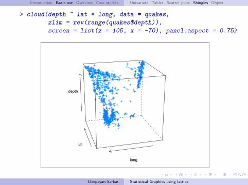
> cloud(depth ~ lat * long, data = quakes,
zlim = rev(range(quakes$depth)),
screen = list(z = 105, x = -70), panel.aspect = 0.75)
lat
long
depth
Deepayan Sarkar Statistical Graphics using lattice
Introduction Basic use Overview Case studies Univariate Tables Scatter plots Shingles Object
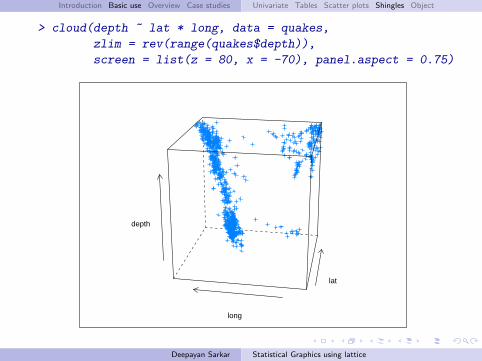
> cloud(depth ~ lat * long, data = quakes,
zlim = rev(range(quakes$depth)),
screen = list(z = 80, x = -70), panel.aspect = 0.75)
lat
long
depth
Deepayan Sarkar Statistical Graphics using lattice
Introduction Basic use Overview Case studies Univariate Tables Scatter plots Shingles Object
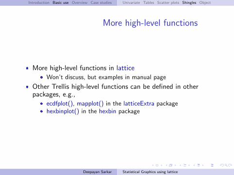
More high-level functions
� More high-level functions in lattice� Won’t discuss, but examples in manual page
� Other Trellis high-level functions can be defined in otherpackages, e.g.,
� ecdfplot(), mapplot() in the latticeExtra package� hexbinplot() in the hexbin package
Deepayan Sarkar Statistical Graphics using lattice
Introduction Basic use Overview Case studies Univariate Tables Scatter plots Shingles Object
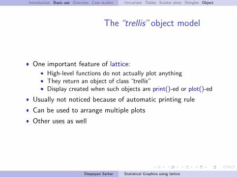
The“trellis”object model
� One important feature of lattice:� High-level functions do not actually plot anything� They return an object of class“trellis”� Display created when such objects are print()-ed or plot()-ed
� Usually not noticed because of automatic printing rule
� Can be used to arrange multiple plots
� Other uses as well
Deepayan Sarkar Statistical Graphics using lattice

Introduction Basic use Overview Case studies Univariate Tables Scatter plots Shingles Object
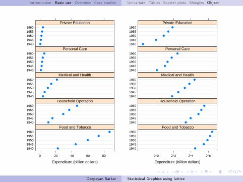
> dp.uspe <-
dotplot(t(USPersonalExpenditure),
groups = FALSE, layout = c(1, 5),
xlab = "Expenditure (billion dollars)")
> dp.uspe.log <-
dotplot(t(USPersonalExpenditure),
groups = FALSE, layout = c(1, 5),
scales = list(x = list(log = 2)),
xlab = "Expenditure (billion dollars)")
> plot(dp.uspe, split = c(1, 1, 2, 1))
> plot(dp.uspe.log, split = c(2, 1, 2, 1), newpage = FALSE)
Deepayan Sarkar Statistical Graphics using lattice
Introduction Basic use Overview Case studies Univariate Tables Scatter plots Shingles Object
Expenditure (billion dollars)
19401945195019551960
0 20 40 60 80
●
●
●
●
●
Food and Tobacco19401945195019551960
●
●
●
●
●
Household Operation19401945195019551960
●
●
●
●
●
Medical and Health19401945195019551960
●
●
●
●
●
Personal Care19401945195019551960
●
●
●
●
●
Private Education
Expenditure (billion dollars)
19401945195019551960
2^0 2^2 2^4 2^6
●
●
●
●
●
Food and Tobacco19401945195019551960
●
●
●
●
●
Household Operation19401945195019551960
●
●
●
●
●
Medical and Health19401945195019551960
●
●
●
●
●
Personal Care19401945195019551960
●
●
●
●
●
Private Education
Deepayan Sarkar Statistical Graphics using lattice

Introduction Basic use Overview Case studies
Trellis Philosophy: Part I
� Display specified in terms of� Type of display (histogram, densityplot, etc.)� Variables with specific roles
� Typical roles for variables� Primary variables: used for the main graphical display� Conditioning variables: used to divide into subgroups and
juxtapose (multipanel conditioning)� Grouping variable: divide into subgroups and superpose
� Primary interface: high-level functions� Each function corresponds to a display type� Specification of roles depends on display type
� Usually specified through the formula and the groups argument
Deepayan Sarkar Statistical Graphics using lattice
Introduction Basic use Overview Case studies
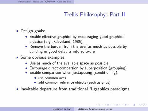
Trellis Philosophy: Part II
� Design goals:� Enable effective graphics by encouraging good graphical
practice (e.g., Cleveland, 1985)� Remove the burden from the user as much as possible by
building in good defaults into software
� Some obvious examples:� Use as much of the available space as possible� Encourage direct comparsion by superposition (grouping)� Enable comparison when juxtaposing (conditioning):
� use common axes� add common reference objects (such as grids)
� Inevitable departure from traditional R graphics paradigms
Deepayan Sarkar Statistical Graphics using lattice

Introduction Basic use Overview Case studies
Trellis Philosophy: Part III
� Any serious graphics system must also be flexible
� lattice tries to balance flexibility and ease of use using thefollowing model:
� A display is made up of various elements� Coordinated defaults provide meaningful results, but� Each element can be controlled independently� The main elements are:
� the primary (panel) display� axis annotation� strip annotation (describing the conditioning process)� legends (typically describing the grouping process)
Deepayan Sarkar Statistical Graphics using lattice

Introduction Basic use Overview Case studies
� The full system would take too long to describe
� Online documentation has details; start with ?Lattice
� We discuss a few advanced ideas using some case studies
Deepayan Sarkar Statistical Graphics using lattice
Introduction Basic use Overview Case studies Regression Lines Reordering Summary
Case studies
� Adding regression lines to scatter plots
� Reordering levels of a factor
Deepayan Sarkar Statistical Graphics using lattice
Introduction Basic use Overview Case studies Regression Lines Reordering Summary
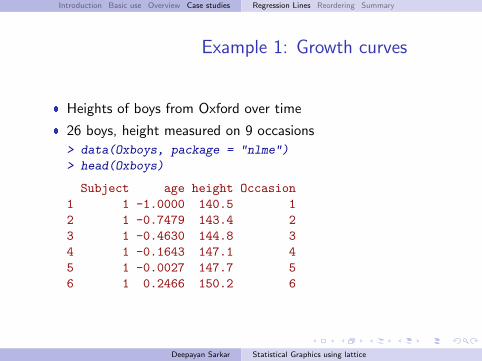
Example 1: Growth curves
� Heights of boys from Oxford over time
� 26 boys, height measured on 9 occasions
> data(Oxboys, package = "nlme")
> head(Oxboys)
Subject age height Occasion1 1 -1.0000 140.5 12 1 -0.7479 143.4 23 1 -0.4630 144.8 34 1 -0.1643 147.1 45 1 -0.0027 147.7 56 1 0.2466 150.2 6
Deepayan Sarkar Statistical Graphics using lattice
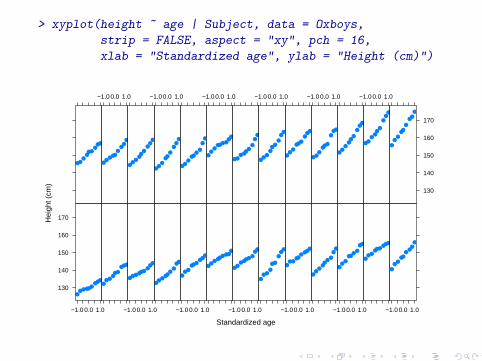
> xyplot(height ~ age | Subject, data = Oxboys,
strip = FALSE, aspect = "xy", pch = 16,
xlab = "Standardized age", ylab = "Height (cm)")
Standardized age
Hei
ght (
cm)
130
140
150
160
170
−1.0 0.0 1.0
●●●●●●
●●●●
●●●●●
●●●
−1.0 0.0 1.0
●●●●●●●
●●
●●
●●●
●●
●●
−1.0 0.0 1.0
●●●
●●●●●
●
●●
●●●●●●●
−1.0 0.0 1.0
●●●●●●●
●●
●●●
●
●●
●●
●
−1.0 0.0 1.0
●●●
●●●
●●●
●●
●●●
●●
●●
−1.0 0.0 1.0
●●
●●●
●●
●●
●●●
●●●●●●
−1.0 0.0 1.0
●
●●
●●●
●●
●
●●●
●●●
●●●
−1.0 0.0 1.0
●●
●●●●
●●
●
●●
●●●
●●
●●
−1.0 0.0 1.0
●●
●●●
●
●●
●
●●
●●●
●●
●●
−1.0 0.0 1.0
●●
●●●●●
●●
●●●●
●●
●
●●
−1.0 0.0 1.0
●●
●●●
●●
●●
●●
●●●●
●●●
−1.0 0.0 1.0
●●●
●●●
●●●
●●
●●●
●
●●
●
−1.0 0.0 1.0
●●●
●●
●
●●
●
130
140
150
160
170
●
●●
●●
●
●●
●
Introduction Basic use Overview Case studies Regression Lines Reordering Summary
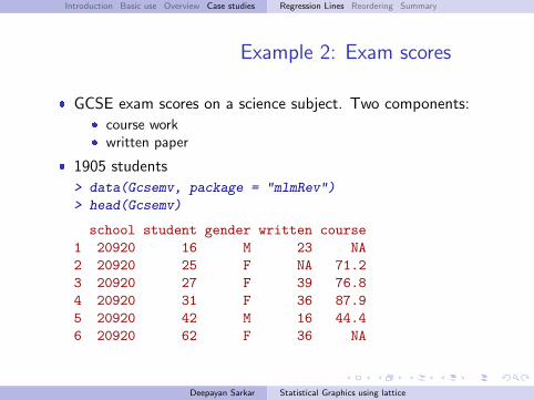
Example 2: Exam scores
� GCSE exam scores on a science subject. Two components:� course work� written paper
� 1905 students
> data(Gcsemv, package = "mlmRev")
> head(Gcsemv)
school student gender written course1 20920 16 M 23 NA2 20920 25 F NA 71.23 20920 27 F 39 76.84 20920 31 F 36 87.95 20920 42 M 16 44.46 20920 62 F 36 NA
Deepayan Sarkar Statistical Graphics using lattice
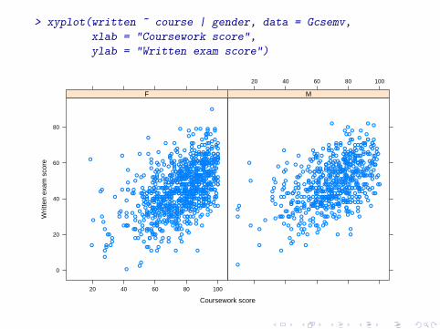
> xyplot(written ~ course | gender, data = Gcsemv,
xlab = "Coursework score",
ylab = "Written exam score")
Coursework score
Writ
ten
exam
sco
re
0
20
40
60
80
20 40 60 80 100
●
●
●●
●
●
●
●
●
●●
●●
●
●
●
●
●
●
●
●
●
●
●
●
●
●
●
●
●
●
●
●
● ●
●●
●
●
●
●
●
●
●
●
●
●
●
●
●
● ●
●
●●
●●
●
●
●
●
●
●
● ●
●
●
●
●
●
●
●
●
●
●
●
●
●
●●
●
●●
●●
●
●
●
●
●
●
●
●
●
●●
●
●
●●
●●
●
●
●
●
●
●
●
● ●
●
●
●
●
●
●
●
●●
●
●
●
●
●
●
●
●
●
●
●
●
●
●
●
●
●
●
●
●
●
●
●
●
●
●
●
●●
●
●
●
●
●
●
●
●
●
●
●
●
●
●
●●
●
●
●
●
●
●
● ●●
●
●
●
●
●
●
●
●
●
●
●
●
●
●
●
●
●
●●
● ●
●
●
●
● ●●
●
●
●
●
●
●
●
●
●
●
●
●
●●
●
●
● ●
●
●
●
●
●
●
●
●
●
●
●
●
●
●
●●
●
●
●
●
●●
●
●
●
●
●
●
●
● ●
●
●
●●
●
●
●
●●●
●
●
●
●
●
●
●
●
●
●
●
●
● ●
●
●
●
●
●
●
●
●
●
●
●
●
●●
●
●
●
●
●
●
●
● ●●
●
●
● ●
●
●
●
●
●
●
●
●
●
●
●
●
●●●
●
●
●
●
●
●
●
●
●●●
●
●●
●
●
●
●
●
●
●
●
●
●
●
●
●
●
●●
●
●
●
●
●●
●
● ●●●●
●
●
●
●
●
●
●
●
●
●
●
●
●
●
●
●
●
●
●
●●
●
●
●
●
●
●
●
●
●
●
●
●
●
●●
●
●
●●
●
●
●
●●
●
●
●
●
●●●
●
●
●
●●
●
●
●
●
●
●
●
●●●
●
●
●
●
●
●
●
●
● ●
●
●
●●
●
●
● ●
●●
●
●
●
●
●
●●●
●
●
●
●
●
●
●
●
●
●
●
●
●
●
●
●
●
●
●
●
●
●
●
●
●
●
●
●
●
●
●●
●
●
● ●
●
●
●
●
●
● ●
● ●
●
●
●
●
●
●
●
●
●
●
●
●
●
●
●
● ●
●
●
●●
●
●
●
● ●
●
●
●
●
●●
●
●
●
●
●
●
●●
●
●
●
●●
●
●
●
●
●●
●
●
●
●
●
●●
●
●
●
●
●
●
●
●
●
●
●
● ●
●
●
●
●●
●●
●
●
●
●
●
●
● ●
●
●
●
●
●
●
●
●
●
● ●
●
●
●
●●
●
●
● ●
●
●●
●
●
●
●
●
●
●
●
●
●
●
●
●
●
●
●
●
●
●
●
●
●
●
●
●
●
●
●
●
●
●
● ●
● ●
●
●
●
●
●
●
●●
●
●●
●
●
●
●
●●
●
●
●●
●
●●
●
●
●
●
●
●
●
●
●●●
●
●
●
●
●
●
●
●
●
●
● ●
●
●
●●
●
●
●
●
●
●
●
●●
●
●
●
●
●
● ●
●
●
●
●
●
●
●
●
●
●
●
●
●
●
●
●
●
●
●
●
●
●
●
●
●
●
●●
●
●
●
●
●
● ●
●
●
●
●
●
●
●
●
●
●
●
●●
●
●●
●
●
●
● ●
●
●
●
●
●
●
●
●
●
● ●
●
●
●
●
●
●
●●
●
●
●
●
●
●
●
●●
●
●
●
●●
●
●
●
●
●
●
●
●
●
●
●
●
●
●
●
●
●
●●
●
●
●
●
●
●
● ●
●
● ●
●
●
●
●
●
●
●
●
●●
●
●
●
●
●
●
●
●
●
●
●
●
●
●
●
●
●
●
●
●
●
●
●●
●
●
●
●
●
●
●
●
●
●
●
●
●
●
●
●● ●
●
●
●
●
●
●
●●
●
●●
●
●
●
●
●●
●
F
20 40 60 80 100
●
●
●
●●● ●
●
●
●
●
●●●
●●
●
●
●
●
●
●
●
●
●
●
●
●
●●
●
●
●
●
●
●
●
●
●
●
●
●
●
●
●
●
●
●
●
●
●
●
●
●
●
●
●
●
●
●
●
●
●
●
●
●
●
●
●
●
●
●
●
●
●
●
●●
●●
●
● ●
●
●
●
●
●
●
●
●
●
●●
●
●
●
●
●
●
●
●
●
●
●
●
●
●●
●
●● ●
●
● ●●
●
●
●
●
●
●
●
●
●
●
●
●●
●
●
●
●
●
●
●
●
●
●
●
● ●
●
●
●
●
●
●
●
●
●
●
●
●
●
●
●●
●
●
●
●
●
●
●
●
●
● ●
●●
●
●
●
●
●
●
●
●
●
●
●●
●
●●●
●
●
●
●
●
●
●
●
●
●
●
●
●
●●
●
●
●
●
●
●
●
●
●
●
●
●
●
●
●
●
●
●
●
●
●
●
●
●
●
●
●
●●
●
●
●
●
●
●●
●
●
●
●
●
●
●
●
●
● ●
●
●●
●
●
●
●
●
●
●
●
●
●
●
●
●
●
●
●
●
●
●
●
●
●
●
●
●
●
●
●
●
●●
●
●
●
●
●
●
●
●
●●
●
●
●
●
●
●
●
●
●
● ●
●
●
●
● ●
●
●
●
●
●
●
●
●
●
●
●
● ●
●
●
●
●
●●
●
●
●
●
●
●●
●
●
●●
●●
●
●
●●
●
●
●
●
●
●
●
●
●
●
●
●
●
●
●
●
●
●
●
●
●
● ●
●
●
●
●●
●
●
●
●
●
●
● ●
●
●
●
●
●
●●
●
●
●
●
●
●
●
● ●
●
●
●
●
●
●●
●●
●
●
●
●
● ●
●
●
●
●
●
●
●
●
●
●
●
●
●
●
●
●
●
●●
●
●●
●
●
●
●
●
●
●
● ●
●
●
●
●
●
●
●
●
●
●
● ●
●
●
●
●
●
●●
●
●
●
●
●
●
●
●
●
●
●
●
●
●
●
●
●
●
●
●
●
●
●
● ●
●
●
●
●
●
●
●
●
●
●
●
●
●●
●
●
●
●
●
●
●
●
●
●
●
●●
●
●
●
●
●
●
●
●
●●
●
●
●
●
●
●●
●
●
●
●
●
●
●
●
●
●
●
●●
●
●
●
●
●
●●
●
●
●
●
●
●●●
●
●
●●
●
●
●
●
●
●
●
●
●
●
●
●
●●
●
●
●
●
●
●
●
●
●
●
●
●
●
●
●
●
●
●
●
●
●
●
●
●
●
●●● ●
●
●
●
●
● ●
●●
●
●
●
●
●
●
●
● ●
M
Introduction Basic use Overview Case studies Regression Lines Reordering Summary
Adding to a Lattice display
� Traditional R graphics encourages incremental additions
� The Lattice analogue is to write panel functions
Deepayan Sarkar Statistical Graphics using lattice
Introduction Basic use Overview Case studies Regression Lines Reordering Summary
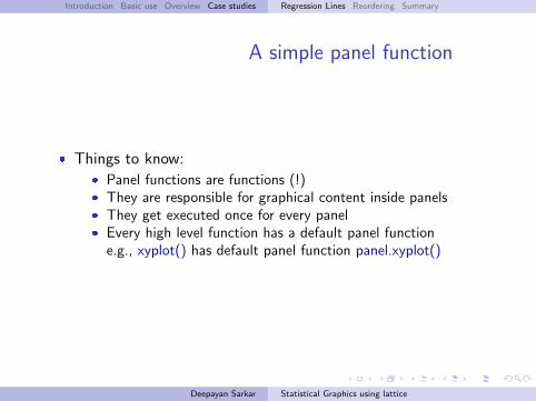
A simple panel function
� Things to know:� Panel functions are functions (!)� They are responsible for graphical content inside panels� They get executed once for every panel� Every high level function has a default panel function
e.g., xyplot() has default panel function panel.xyplot()
Deepayan Sarkar Statistical Graphics using lattice
Introduction Basic use Overview Case studies Regression Lines Reordering Summary
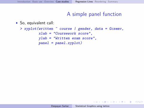
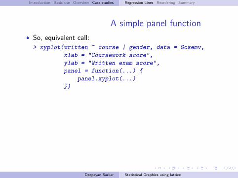
A simple panel function
� So, equivalent call:
> xyplot(written ~ course | gender, data = Gcsemv,
xlab = "Coursework score",
ylab = "Written exam score",
panel = panel.xyplot)
Deepayan Sarkar Statistical Graphics using lattice
Introduction Basic use Overview Case studies Regression Lines Reordering Summary
A simple panel function
� So, equivalent call:
> xyplot(written ~ course | gender, data = Gcsemv,
xlab = "Coursework score",
ylab = "Written exam score",
panel = function(...) {
panel.xyplot(...)
})
Deepayan Sarkar Statistical Graphics using lattice
Introduction Basic use Overview Case studies Regression Lines Reordering Summary
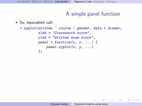
A simple panel function
� So, equivalent call:
> xyplot(written ~ course | gender, data = Gcsemv,
xlab = "Coursework score",
ylab = "Written exam score",
panel = function(x, y, ...) {
panel.xyplot(x, y, ...)
})
Deepayan Sarkar Statistical Graphics using lattice
Introduction Basic use Overview Case studies Regression Lines Reordering Summary
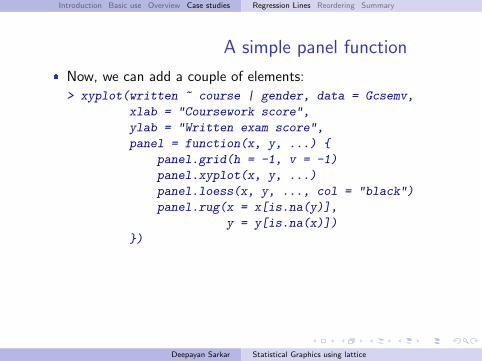
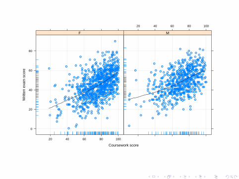
A simple panel function
� Now, we can add a couple of elements:
> xyplot(written ~ course | gender, data = Gcsemv,
xlab = "Coursework score",
ylab = "Written exam score",
panel = function(x, y, ...) {
panel.grid(h = -1, v = -1)
panel.xyplot(x, y, ...)
panel.loess(x, y, ..., col = "black")
panel.rug(x = x[is.na(y)],
y = y[is.na(x)])
})
Deepayan Sarkar Statistical Graphics using lattice
Coursework score
Writ
ten
exam
sco
re
0
20
40
60
80
20 40 60 80 100
●
●
●●
●
●
●
●
●
●●
●●
●
●
●
●
●
●
●
●
●
●
●
●
●
●
●
●
●
●
●
●
● ●
●●
●
●
●
●
●
●
●
●
●
●
●
●
●
● ●
●
●●
●●
●
●
●
●
●
●
● ●
●
●
●
●
●
●
●
●
●
●
●
●
●
●●
●
●●
●●
●
●
●
●
●
●
●
●
●
●●
●
●
●●
●●
●
●
●
●
●
●
●
● ●
●
●
●
●
●
●
●
●●
●
●
●
●
●
●
●
●
●
●
●
●
●
●
●
●
●
●
●
●
●
●
●
●
●
●
●
●●
●
●
●
●
●
●
●
●
●
●
●
●
●
●
●●
●
●
●
●
●
●
● ●●
●
●
●
●
●
●
●
●
●
●
●
●
●
●
●
●
●
●●
● ●
●
●
●
● ●●
●
●
●
●
●
●
●
●
●
●
●
●
●●
●
●
● ●
●
●
●
●
●
●
●
●
●
●
●
●
●
●
●●
●
●
●
●
●●
●
●
●
●
●
●
●
● ●
●
●
●●
●
●
●
●●●
●
●
●
●
●
●
●
●
●
●
●
●
● ●
●
●
●
●
●
●
●
●
●
●
●
●
●●
●
●
●
●
●
●
●
● ●●
●
●
● ●
●
●
●
●
●
●
●
●
●
●
●
●
●●●
●
●
●
●
●
●
●
●
●●●
●
●●
●
●
●
●
●
●
●
●
●
●
●
●
●
●
●●
●
●
●
●
●●
●
● ●●●●
●
●
●
●
●
●
●
●
●
●
●
●
●
●
●
●
●
●
●
●●
●
●
●
●
●
●
●
●
●
●
●
●
●
●●
●
●
●●
●
●
●
●●
●
●
●
●
●●●
●
●
●
●●
●
●
●
●
●
●
●
●●●
●
●
●
●
●
●
●
●
● ●
●
●
●●
●
●
● ●
●●
●
●
●
●
●
●●●
●
●
●
●
●
●
●
●
●
●
●
●
●
●
●
●
●
●
●
●
●
●
●
●
●
●
●
●
●
●
●●
●
●
● ●
●
●
●
●
●
● ●
● ●
●
●
●
●
●
●
●
●
●
●
●
●
●
●
●
● ●
●
●
●●
●
●
●
● ●
●
●
●
●
●●
●
●
●
●
●
●
●●
●
●
●
●●
●
●
●
●
●●
●
●
●
●
●
●●
●
●
●
●
●
●
●
●
●
●
●
● ●
●
●
●
●●
●●
●
●
●
●
●
●
● ●
●
●
●
●
●
●
●
●
●
● ●
●
●
●
●●
●
●
● ●
●
●●
●
●
●
●
●
●
●
●
●
●
●
●
●
●
●
●
●
●
●
●
●
●
●
●
●
●
●
●
●
●
●
● ●
● ●
●
●
●
●
●
●
●●
●
●●
●
●
●
●
●●
●
●
●●
●
●●
●
●
●
●
●
●
●
●
●●●
●
●
●
●
●
●
●
●
●
●
● ●
●
●
●●
●
●
●
●
●
●
●
●●
●
●
●
●
●
● ●
●
●
●
●
●
●
●
●
●
●
●
●
●
●
●
●
●
●
●
●
●
●
●
●
●
●
●●
●
●
●
●
●
● ●
●
●
●
●
●
●
●
●
●
●
●
●●
●
●●
●
●
●
● ●
●
●
●
●
●
●
●
●
●
● ●
●
●
●
●
●
●
●●
●
●
●
●
●
●
●
●●
●
●
●
●●
●
●
●
●
●
●
●
●
●
●
●
●
●
●
●
●
●
●●
●
●
●
●
●
●
● ●
●
● ●
●
●
●
●
●
●
●
●
●●
●
●
●
●
●
●
●
●
●
●
●
●
●
●
●
●
●
●
●
●
●
●
●●
●
●
●
●
●
●
●
●
●
●
●
●
●
●
●
●● ●
●
●
●
●
●
●
●●
●
●●
●
●
●
●
●●
●
F
20 40 60 80 100
●
●
●
●●● ●
●
●
●
●
●●●
●●
●
●
●
●
●
●
●
●
●
●
●
●
●●
●
●
●
●
●
●
●
●
●
●
●
●
●
●
●
●
●
●
●
●
●
●
●
●
●
●
●
●
●
●
●
●
●
●
●
●
●
●
●
●
●
●
●
●
●
●
●●
●●
●
● ●
●
●
●
●
●
●
●
●
●
●●
●
●
●
●
●
●
●
●
●
●
●
●
●
●●
●
●● ●
●
● ●●
●
●
●
●
●
●
●
●
●
●
●
●●
●
●
●
●
●
●
●
●
●
●
●
● ●
●
●
●
●
●
●
●
●
●
●
●
●
●
●
●●
●
●
●
●
●
●
●
●
●
● ●
●●
●
●
●
●
●
●
●
●
●
●
●●
●
●●●
●
●
●
●
●
●
●
●
●
●
●
●
●
●●
●
●
●
●
●
●
●
●
●
●
●
●
●
●
●
●
●
●
●
●
●
●
●
●
●
●
●
●●
●
●
●
●
●
●●
●
●
●
●
●
●
●
●
●
● ●
●
●●
●
●
●
●
●
●
●
●
●
●
●
●
●
●
●
●
●
●
●
●
●
●
●
●
●
●
●
●
●
●●
●
●
●
●
●
●
●
●
●●
●
●
●
●
●
●
●
●
●
● ●
●
●
●
● ●
●
●
●
●
●
●
●
●
●
●
●
● ●
●
●
●
●
●●
●
●
●
●
●
●●
●
●
●●
●●
●
●
●●
●
●
●
●
●
●
●
●
●
●
●
●
●
●
●
●
●
●
●
●
●
● ●
●
●
●
●●
●
●
●
●
●
●
● ●
●
●
●
●
●
●●
●
●
●
●
●
●
●
● ●
●
●
●
●
●
●●
●●
●
●
●
●
● ●
●
●
●
●
●
●
●
●
●
●
●
●
●
●
●
●
●
●●
●
●●
●
●
●
●
●
●
●
● ●
●
●
●
●
●
●
●
●
●
●
● ●
●
●
●
●
●
●●
●
●
●
●
●
●
●
●
●
●
●
●
●
●
●
●
●
●
●
●
●
●
●
● ●
●
●
●
●
●
●
●
●
●
●
●
●
●●
●
●
●
●
●
●
●
●
●
●
●
●●
●
●
●
●
●
●
●
●
●●
●
●
●
●
●
●●
●
●
●
●
●
●
●
●
●
●
●
●●
●
●
●
●
●
●●
●
●
●
●
●
●●●
●
●
●●
●
●
●
●
●
●
●
●
●
●
●
●
●●
●
●
●
●
●
●
●
●
●
●
●
●
●
●
●
●
●
●
●
●
●
●
●
●
●
●●● ●
●
●
●
●
● ●
●●
●
●
●
●
●
●
●
● ●
M
Introduction Basic use Overview Case studies Regression Lines Reordering Summary
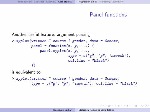
Panel functions
Another useful feature: argument passing
> xyplot(written ~ course | gender, data = Gcsemv,
panel = function(x, y, ...) {
panel.xyplot(x, y, ...,
type = c("g", "p", "smooth"),
col.line = "black")
})
is equivalent to
> xyplot(written ~ course | gender, data = Gcsemv,
type = c("g", "p", "smooth"), col.line = "black")
Deepayan Sarkar Statistical Graphics using lattice

course
writ
ten
0
20
40
60
80
20 40 60 80 100
●
●
●●
●
●
●
●
●
●●
●●
●
●
●
●
●
●
●
●
●
●
●
●
●
●
●
●
●
●
●
●
● ●
●●
●
●
●
●
●
●
●
●
●
●
●
●
●
● ●
●
●●
●●
●
●
●
●
●
●
● ●
●
●
●
●
●
●
●
●
●
●
●
●
●
●●
●
●●
●●
●
●
●
●
●
●
●
●
●
●●
●
●
●●
●●
●
●
●
●
●
●
●
● ●
●
●
●
●
●
●
●
●●
●
●
●
●
●
●
●
●
●
●
●
●
●
●
●
●
●
●
●
●
●
●
●
●
●
●
●
●●
●
●
●
●
●
●
●
●
●
●
●
●
●
●
●●
●
●
●
●
●
●
● ●●
●
●
●
●
●
●
●
●
●
●
●
●
●
●
●
●
●
●●
● ●
●
●
●
● ●●
●
●
●
●
●
●
●
●
●
●
●
●
●●
●
●
● ●
●
●
●
●
●
●
●
●
●
●
●
●
●
●
●●
●
●
●
●
●●
●
●
●
●
●
●
●
● ●
●
●
●●
●
●
●
●●●
●
●
●
●
●
●
●
●
●
●
●
●
● ●
●
●
●
●
●
●
●
●
●
●
●
●
●●
●
●
●
●
●
●
●
● ●●
●
●
● ●
●
●
●
●
●
●
●
●
●
●
●
●
●●●
●
●
●
●
●
●
●
●
●●●
●
●●
●
●
●
●
●
●
●
●
●
●
●
●
●
●
●●
●
●
●
●
●●
●
● ●●●●
●
●
●
●
●
●
●
●
●
●
●
●
●
●
●
●
●
●
●
●●
●
●
●
●
●
●
●
●
●
●
●
●
●
●●
●
●
●●
●
●
●
●●
●
●
●
●
●●●
●
●
●
●●
●
●
●
●
●
●
●
●●●
●
●
●
●
●
●
●
●
● ●
●
●
●●
●
●
● ●
●●
●
●
●
●
●
●●●
●
●
●
●
●
●
●
●
●
●
●
●
●
●
●
●
●
●
●
●
●
●
●
●
●
●
●
●
●
●
●●
●
●
● ●
●
●
●
●
●
● ●
● ●
●
●
●
●
●
●
●
●
●
●
●
●
●
●
●
● ●
●
●
●●
●
●
●
● ●
●
●
●
●
●●
●
●
●
●
●
●
●●
●
●
●
●●
●
●
●
●
●●
●
●
●
●
●
●●
●
●
●
●
●
●
●
●
●
●
●
● ●
●
●
●
●●
●●
●
●
●
●
●
●
● ●
●
●
●
●
●
●
●
●
●
● ●
●
●
●
●●
●
●
● ●
●
●●
●
●
●
●
●
●
●
●
●
●
●
●
●
●
●
●
●
●
●
●
●
●
●
●
●
●
●
●
●
●
●
● ●
● ●
●
●
●
●
●
●
●●
●
●●
●
●
●
●
●●
●
●
●●
●
●●
●
●
●
●
●
●
●
●
●●●
●
●
●
●
●
●
●
●
●
●
● ●
●
●
●●
●
●
●
●
●
●
●
●●
●
●
●
●
●
● ●
●
●
●
●
●
●
●
●
●
●
●
●
●
●
●
●
●
●
●
●
●
●
●
●
●
●
●●
●
●
●
●
●
● ●
●
●
●
●
●
●
●
●
●
●
●
●●
●
●●
●
●
●
● ●
●
●
●
●
●
●
●
●
●
● ●
●
●
●
●
●
●
●●
●
●
●
●
●
●
●
●●
●
●
●
●●
●
●
●
●
●
●
●
●
●
●
●
●
●
●
●
●
●
●●
●
●
●
●
●
●
● ●
●
● ●
●
●
●
●
●
●
●
●
●●
●
●
●
●
●
●
●
●
●
●
●
●
●
●
●
●
●
●
●
●
●
●
●●
●
●
●
●
●
●
●
●
●
●
●
●
●
●
●
●● ●
●
●
●
●
●
●
●●
●
●●
●
●
●
●
●●
●
F
20 40 60 80 100
●
●
●
●●● ●
●
●
●
●
●●●
●●
●
●
●
●
●
●
●
●
●
●
●
●
●●
●
●
●
●
●
●
●
●
●
●
●
●
●
●
●
●
●
●
●
●
●
●
●
●
●
●
●
●
●
●
●
●
●
●
●
●
●
●
●
●
●
●
●
●
●
●
●●
●●
●
● ●
●
●
●
●
●
●
●
●
●
●●
●
●
●
●
●
●
●
●
●
●
●
●
●
●●
●
●● ●
●
● ●●
●
●
●
●
●
●
●
●
●
●
●
●●
●
●
●
●
●
●
●
●
●
●
●
● ●
●
●
●
●
●
●
●
●
●
●
●
●
●
●
●●
●
●
●
●
●
●
●
●
●
● ●
●●
●
●
●
●
●
●
●
●
●
●
●●
●
●●●
●
●
●
●
●
●
●
●
●
●
●
●
●
●●
●
●
●
●
●
●
●
●
●
●
●
●
●
●
●
●
●
●
●
●
●
●
●
●
●
●
●
●●
●
●
●
●
●
●●
●
●
●
●
●
●
●
●
●
● ●
●
●●
●
●
●
●
●
●
●
●
●
●
●
●
●
●
●
●
●
●
●
●
●
●
●
●
●
●
●
●
●
●●
●
●
●
●
●
●
●
●
●●
●
●
●
●
●
●
●
●
●
● ●
●
●
●
● ●
●
●
●
●
●
●
●
●
●
●
●
● ●
●
●
●
●
●●
●
●
●
●
●
●●
●
●
●●
●●
●
●
●●
●
●
●
●
●
●
●
●
●
●
●
●
●
●
●
●
●
●
●
●
●
● ●
●
●
●
●●
●
●
●
●
●
●
● ●
●
●
●
●
●
●●
●
●
●
●
●
●
●
● ●
●
●
●
●
●
●●
●●
●
●
●
●
● ●
●
●
●
●
●
●
●
●
●
●
●
●
●
●
●
●
●
●●
●
●●
●
●
●
●
●
●
●
● ●
●
●
●
●
●
●
●
●
●
●
● ●
●
●
●
●
●
●●
●
●
●
●
●
●
●
●
●
●
●
●
●
●
●
●
●
●
●
●
●
●
●
● ●
●
●
●
●
●
●
●
●
●
●
●
●
●●
●
●
●
●
●
●
●
●
●
●
●
●●
●
●
●
●
●
●
●
●
●●
●
●
●
●
●
●●
●
●
●
●
●
●
●
●
●
●
●
●●
●
●
●
●
●
●●
●
●
●
●
●
●●●
●
●
●●
●
●
●
●
●
●
●
●
●
●
●
●
●●
●
●
●
●
●
●
●
●
●
●
●
●
●
●
●
●
●
●
●
●
●
●
●
●
●
●●● ●
●
●
●
●
● ●
●●
●
●
●
●
●
●
●
● ●
M
Introduction Basic use Overview Case studies Regression Lines Reordering Summary
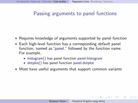
Passing arguments to panel functions
� Requires knowledge of arguments supported by panel function
� Each high-level function has a corresponding default panelfunction, named as “panel.” followed by the function name.For example,
� histogram() has panel function panel.histogram� dotplot() has panel function panel.dotplot
� Most have useful arguments that support common variants
Deepayan Sarkar Statistical Graphics using lattice
Introduction Basic use Overview Case studies Regression Lines Reordering Summary
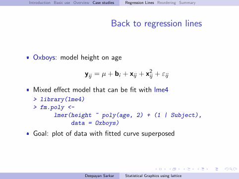
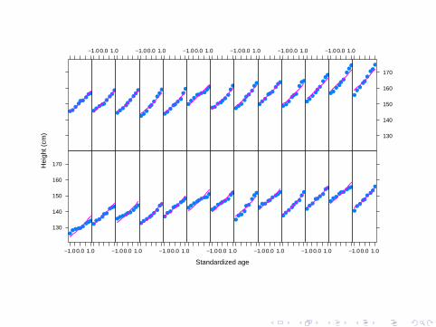
Back to regression lines
� Oxboys: model height on age
yij = µ+ bi + xij + x2ij + εij
� Mixed effect model that can be fit with lme4
> library(lme4)
> fm.poly <-
lmer(height ~ poly(age, 2) + (1 | Subject),
data = Oxboys)
� Goal: plot of data with fitted curve superposed
Deepayan Sarkar Statistical Graphics using lattice
Standardized age
Hei
ght (
cm)
130
140
150
160
170
−1.0 0.0 1.0
●●●●●●
●●●●
●●●●●
●●●
−1.0 0.0 1.0
●●●●●●●
●●
●●
●●●
●●
●●
−1.0 0.0 1.0
●●●
●●●●●
●
●●
●●●●●●●
−1.0 0.0 1.0
●●●●●●●
●●
●●●
●
●●
●●
●
−1.0 0.0 1.0
●●●
●●●
●●●
●●
●●●
●●
●●
−1.0 0.0 1.0
●●
●●●
●●
●●
●●●
●●●●●●
−1.0 0.0 1.0
●
●●
●●●
●●
●
●●●
●●●
●●●
−1.0 0.0 1.0
●●
●●●●
●●
●
●●
●●●
●●
●●
−1.0 0.0 1.0
●●
●●●
●
●●
●
●●
●●●
●●
●●
−1.0 0.0 1.0
●●
●●●●●
●●
●●●●
●●
●
●●
−1.0 0.0 1.0
●●
●●●
●●
●●
●●
●●●●
●●●
−1.0 0.0 1.0
●●●
●●●
●●●
●●
●●●
●
●●
●
−1.0 0.0 1.0
●●●
●●
●
●●
●
130
140
150
160
170
●
●●
●●
●
●●
●
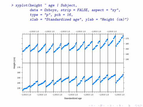
> xyplot(height ~ age | Subject,
data = Oxboys, strip = FALSE, aspect = "xy",
type = "p", pch = 16,
xlab = "Standardized age", ylab = "Height (cm)")
Standardized age
Hei
ght (
cm)
130
140
150
160
170
−1.0 0.0 1.0
●●●●●●
●●●●
●●●●●
●●●
−1.0 0.0 1.0
●●●●●●●
●●
●●
●●●
●●
●●
−1.0 0.0 1.0
●●●
●●●●●
●
●●
●●●●●●●
−1.0 0.0 1.0
●●●●●●●
●●
●●●
●
●●
●●
●
−1.0 0.0 1.0
●●●
●●●
●●●
●●
●●●
●●
●●
−1.0 0.0 1.0
●●
●●●
●●
●●
●●●
●●●●●●
−1.0 0.0 1.0
●
●●
●●●
●●
●
●●●
●●●
●●●
−1.0 0.0 1.0
●●
●●●●
●●
●
●●
●●●
●●
●●
−1.0 0.0 1.0
●●
●●●
●
●●
●
●●
●●●
●●
●●
−1.0 0.0 1.0
●●
●●●●●
●●
●●●●
●●
●
●●
−1.0 0.0 1.0
●●
●●●
●●
●●
●●
●●●●
●●●
−1.0 0.0 1.0
●●●
●●●
●●●
●●
●●●
●
●●
●
−1.0 0.0 1.0
●●●
●●
●
●●
●
130
140
150
160
170
●
●●
●●
●
●●
●
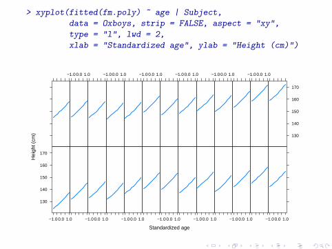
> xyplot(fitted(fm.poly) ~ age | Subject,
data = Oxboys, strip = FALSE, aspect = "xy",
type = "l", lwd = 2,
xlab = "Standardized age", ylab = "Height (cm)")
Standardized age
Hei
ght (
cm)
130
140
150
160
170
−1.0 0.0 1.0 −1.0 0.0 1.0 −1.0 0.0 1.0 −1.0 0.0 1.0 −1.0 0.0 1.0 −1.0 0.0 1.0 −1.0 0.0 1.0
−1.0 0.0 1.0 −1.0 0.0 1.0 −1.0 0.0 1.0 −1.0 0.0 1.0 −1.0 0.0 1.0 −1.0 0.0 1.0
130
140
150
160
170
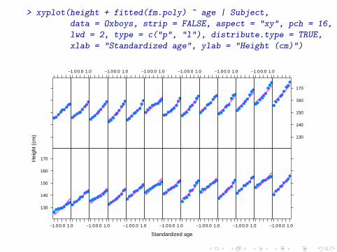
> xyplot(height + fitted(fm.poly) ~ age | Subject,
data = Oxboys, strip = FALSE, aspect = "xy", pch = 16,
lwd = 2, type = c("p", "l"), distribute.type = TRUE,
xlab = "Standardized age", ylab = "Height (cm)")
Standardized age
Hei
ght (
cm)
130
140
150
160
170
−1.0 0.0 1.0
●●●●●●
●●●●
●●●●●
●●●
−1.0 0.0 1.0
●●●●●●●
●●
●●
●●●
●●
●●
−1.0 0.0 1.0
●●●
●●●●●
●
●●
●●●●●●●
−1.0 0.0 1.0
●●●●●●●
●●
●●●
●
●●
●●
●
−1.0 0.0 1.0
●●●
●●●
●●●
●●
●●●
●●
●●
−1.0 0.0 1.0
●●
●●●
●●
●●
●●●
●●●●●●
−1.0 0.0 1.0
●
●●
●●●
●●
●
●●●
●●●
●●●
−1.0 0.0 1.0
●●
●●●●
●●
●
●●
●●●
●●
●●
−1.0 0.0 1.0
●●
●●●
●
●●
●
●●
●●●
●●
●●
−1.0 0.0 1.0
●●
●●●●●
●●
●●●●
●●
●
●●
−1.0 0.0 1.0
●●
●●●
●●
●●
●●
●●●●
●●●
−1.0 0.0 1.0
●●●
●●●
●●●
●●
●●●
●
●●
●
−1.0 0.0 1.0
●●●
●●
●
●●
●
130
140
150
160
170
●
●●
●●
●
●●
●

Introduction Basic use Overview Case studies Regression Lines Reordering Summary
GCSE exam scores
� Gcsemv: model written score by coursework and gender
� A similar approach does not work as well� x values are not ordered� missing values are omitted from fitted model
Deepayan Sarkar Statistical Graphics using lattice
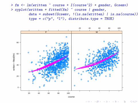
> fm <- lm(written ~ course + I(course^2) + gender, Gcsemv)
> xyplot(written + fitted(fm) ~ course | gender,
data = subset(Gcsemv, !(is.na(written) | is.na(course))),
type = c("p", "l"), distribute.type = TRUE)
course
writ
ten
+ fi
tted(
fm)
0
20
40
60
80
20 40 60 80 100
●
●
●●
●
●
●
●
●
●●
●●
●
●
●
●
●
●
●
●
●
●
●
●
●
●
●
●
●
●
●
●
● ●
●●
●
●
●
●
●
●
●
●
●
●
●
●
●
● ●
●
●●
●●
●
●
●
●
●
●
● ●
●
●
●
●
●
●
●
●
●
●
●
●
●
●●
●
●●
●●
●
●
●
●
●
●
●
●
●
●●
●
●
●●
●●
●
●
●
●
●
●
●
● ●
●
●
●
●
●
●
●
●●
●
●
●
●
●
●
●
●
●
●
●
●
●
●
●
●
●
●
●
●
●
●
●
●
●
●
●
●●
●
●
●
●
●
●
●
●
●
●
●
●
●
●
●●
●
●
●
●
●
●
● ●●
●
●
●
●
●
●
●
●
●
●
●
●
●
●
●
●
●
●●
● ●
●
●
●
● ●●
●
●
●
●
●
●
●
●
●
●
●
●
●●
●
●
● ●
●
●
●
●
●
●
●
●
●
●
●
●
●
●
●●
●
●
●
●
●●
●
●
●
●
●
●
●
● ●
●
●
●●
●
●
●
●●●
●
●
●
●
●
●
●
●
●
●
●
●
● ●
●
●
●
●
●
●
●
●
●
●
●
●
●●
●
●
●
●
●
●
●
● ●●
●
●
● ●
●
●
●
●
●
●
●
●
●
●
●
●
●●●
●
●
●
●
●
●
●
●
●●●
●
●●
●
●
●
●
●
●
●
●
●
●
●
●
●
●
●●
●
●
●
●
●●
●
● ●●●●
●
●
●
●
●
●
●
●
●
●
●
●
●
●
●
●
●
●
●
●●
●
●
●
●
●
●
●
●
●
●
●
●
●
●●
●
●
●●
●
●
●
●●
●
●
●
●
●●●
●
●
●
●●
●
●
●
●
●
●
●
●●●
●
●
●
●
●
●
●
●
● ●
●
●
●●
●
●
● ●
●●
●
●
●
●
●
●●●
●
●
●
●
●
●
●
●
●
●
●
●
●
●
●
●
●
●
●
●
●
●
●
●
●
●
●
●
●
●
●●
●
●
● ●
●
●
●
●
●
● ●
● ●
●
●
●
●
●
●
●
●
●
●
●
●
●
●
●
● ●
●
●
●●
●
●
●
● ●
●
●
●
●
●●
●
●
●
●
●
●
●●
●
●
●
●●
●
●
●
●
●●
●
●
●
●
●
●●
●
●
●
●
●
●
●
●
●
●
●
● ●
●
●
●
●●
●●
●
●
●
●
●
●
● ●
●
●
●
●
●
●
●
●
●
● ●
●
●
●
●●
●
●
● ●
●
●●
●
●
●
●
●
●
●
●
●
●
●
●
●
●
●
●
●
●
●
●
●
●
●
●
●
●
●
●
●
●
●
● ●
● ●
●
●
●
●
●
●
●●
●
●●
●
●
●
●
●●
●
●
●●
●
●●
●
●
●
●
●
●
●
●
●●●
●
●
●
●
●
●
●
●
●
●
● ●
●
●
●●
●
●
●
●
●
●
●
●●
●
●
●
●
●
● ●
●
●
●
●
●
●
●
●
●
●
●
●
●
●
●
●
●
●
●
●
●
●
●
●
●
●
●●
●
●
●
●
●
● ●
●
●
●
●
●
●
●
●
●
●
●
●●
●
●●
●
●
●
● ●
●
●
●
●
●
●
●
●
●
● ●
●
●
●
●
●
●
●●
●
●
●
●
●
●
●
●●
●
●
●
●●
●
●
●
●
●
●
●
●
●
●
●
●
●
●
●
●
●
●●
●
●
●
●
●
●
● ●
●
● ●
●
●
●
●
●
●
●
●
●●
●
●
●
●
●
●
●
●
●
●
●
●
●
●
●
●
●
●
●
●
●
●
●●
●
●
●
●
●
●
●
●
●
●
●
●
●
●
●
●● ●
●
●
●
●
●
●
●●
●
●●
●
●
●
●
●●
●
F
20 40 60 80 100
●
●
●
●●● ●
●
●
●
●
●●●
●●
●
●
●
●
●
●
●
●
●
●
●
●
●●
●
●
●
●
●
●
●
●
●
●
●
●
●
●
●
●
●
●
●
●
●
●
●
●
●
●
●
●
●
●
●
●
●
●
●
●
●
●
●
●
●
●
●
●
●
●
●●
●●
●
● ●
●
●
●
●
●
●
●
●
●
●●
●
●
●
●
●
●
●
●
●
●
●
●
●
●●
●
●● ●
●
● ●●
●
●
●
●
●
●
●
●
●
●
●
●●
●
●
●
●
●
●
●
●
●
●
●
● ●
●
●
●
●
●
●
●
●
●
●
●
●
●
●
●●
●
●
●
●
●
●
●
●
●
● ●
●●
●
●
●
●
●
●
●
●
●
●
●●
●
●●●
●
●
●
●
●
●
●
●
●
●
●
●
●
●●
●
●
●
●
●
●
●
●
●
●
●
●
●
●
●
●
●
●
●
●
●
●
●
●
●
●
●
●●
●
●
●
●
●
●●
●
●
●
●
●
●
●
●
●
● ●
●
●●
●
●
●
●
●
●
●
●
●
●
●
●
●
●
●
●
●
●
●
●
●
●
●
●
●
●
●
●
●
●●
●
●
●
●
●
●
●
●
●●
●
●
●
●
●
●
●
●
●
● ●
●
●
●
● ●
●
●
●
●
●
●
●
●
●
●
●
● ●
●
●
●
●
●●
●
●
●
●
●
●●
●
●
●●
●●
●
●
●●
●
●
●
●
●
●
●
●
●
●
●
●
●
●
●
●
●
●
●
●
●
● ●
●
●
●
●●
●
●
●
●
●
●
● ●
●
●
●
●
●
●●
●
●
●
●
●
●
●
● ●
●
●
●
●
●
●●
●●
●
●
●
●
● ●
●
●
●
●
●
●
●
●
●
●
●
●
●
●
●
●
●
●●
●
●●
●
●
●
●
●
●
●
● ●
●
●
●
●
●
●
●
●
●
●
● ●
●
●
●
●
●
●●
●
●
●
●
●
●
●
●
●
●
●
●
●
●
●
●
●
●
●
●
●
●
●
● ●
●
●
●
●
●
●
●
●
●
●
●
●
●●
●
●
●
●
●
●
●
●
●
●
●
●●
●
●
●
●
●
●
●
●
●●
●
●
●
●
●
●●
●
●
●
●
●
●
●
●
●
●
●
●●
●
●
●
●
●
●●
●
●
●
●
●
●●●
●
●
●●
●
●
●
●
●
●
●
●
●
●
●
●
●●
●
●
●
●
●
●
●
●
●
●
●
●
●
●
●
●
●
●
●
●
●
●
●
●
●
●●● ●
●
●
●
●
● ●
●●
●
●
●
●
●
●
●
● ●
M
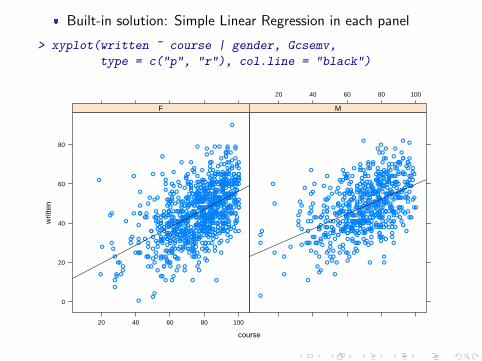
� Built-in solution: Simple Linear Regression in each panel
> xyplot(written ~ course | gender, Gcsemv,
type = c("p", "r"), col.line = "black")
course
writ
ten
0
20
40
60
80
20 40 60 80 100
●
●
●●
●
●
●
●
●
●●
●●
●
●
●
●
●
●
●
●
●
●
●
●
●
●
●
●
●
●
●
●
● ●
●●
●
●
●
●
●
●
●
●
●
●
●
●
●
● ●
●
●●
●●
●
●
●
●
●
●
● ●
●
●
●
●
●
●
●
●
●
●
●
●
●
●●
●
●●
●●
●
●
●
●
●
●
●
●
●
●●
●
●
●●
●●
●
●
●
●
●
●
●
● ●
●
●
●
●
●
●
●
●●
●
●
●
●
●
●
●
●
●
●
●
●
●
●
●
●
●
●
●
●
●
●
●
●
●
●
●
●●
●
●
●
●
●
●
●
●
●
●
●
●
●
●
●●
●
●
●
●
●
●
● ●●
●
●
●
●
●
●
●
●
●
●
●
●
●
●
●
●
●
●●
● ●
●
●
●
● ●●
●
●
●
●
●
●
●
●
●
●
●
●
●●
●
●
● ●
●
●
●
●
●
●
●
●
●
●
●
●
●
●
●●
●
●
●
●
●●
●
●
●
●
●
●
●
● ●
●
●
●●
●
●
●
●●●
●
●
●
●
●
●
●
●
●
●
●
●
● ●
●
●
●
●
●
●
●
●
●
●
●
●
●●
●
●
●
●
●
●
●
● ●●
●
●
● ●
●
●
●
●
●
●
●
●
●
●
●
●
●●●
●
●
●
●
●
●
●
●
●●●
●
●●
●
●
●
●
●
●
●
●
●
●
●
●
●
●
●●
●
●
●
●
●●
●
● ●●●●
●
●
●
●
●
●
●
●
●
●
●
●
●
●
●
●
●
●
●
●●
●
●
●
●
●
●
●
●
●
●
●
●
●
●●
●
●
●●
●
●
●
●●
●
●
●
●
●●●
●
●
●
●●
●
●
●
●
●
●
●
●●●
●
●
●
●
●
●
●
●
● ●
●
●
●●
●
●
● ●
●●
●
●
●
●
●
●●●
●
●
●
●
●
●
●
●
●
●
●
●
●
●
●
●
●
●
●
●
●
●
●
●
●
●
●
●
●
●
●●
●
●
● ●
●
●
●
●
●
● ●
● ●
●
●
●
●
●
●
●
●
●
●
●
●
●
●
●
● ●
●
●
●●
●
●
●
● ●
●
●
●
●
●●
●
●
●
●
●
●
●●
●
●
●
●●
●
●
●
●
●●
●
●
●
●
●
●●
●
●
●
●
●
●
●
●
●
●
●
● ●
●
●
●
●●
●●
●
●
●
●
●
●
● ●
●
●
●
●
●
●
●
●
●
● ●
●
●
●
●●
●
●
● ●
●
●●
●
●
●
●
●
●
●
●
●
●
●
●
●
●
●
●
●
●
●
●
●
●
●
●
●
●
●
●
●
●
●
● ●
● ●
●
●
●
●
●
●
●●
●
●●
●
●
●
●
●●
●
●
●●
●
●●
●
●
●
●
●
●
●
●
●●●
●
●
●
●
●
●
●
●
●
●
● ●
●
●
●●
●
●
●
●
●
●
●
●●
●
●
●
●
●
● ●
●
●
●
●
●
●
●
●
●
●
●
●
●
●
●
●
●
●
●
●
●
●
●
●
●
●
●●
●
●
●
●
●
● ●
●
●
●
●
●
●
●
●
●
●
●
●●
●
●●
●
●
●
● ●
●
●
●
●
●
●
●
●
●
● ●
●
●
●
●
●
●
●●
●
●
●
●
●
●
●
●●
●
●
●
●●
●
●
●
●
●
●
●
●
●
●
●
●
●
●
●
●
●
●●
●
●
●
●
●
●
● ●
●
● ●
●
●
●
●
●
●
●
●
●●
●
●
●
●
●
●
●
●
●
●
●
●
●
●
●
●
●
●
●
●
●
●
●●
●
●
●
●
●
●
●
●
●
●
●
●
●
●
●
●● ●
●
●
●
●
●
●
●●
●
●●
●
●
●
●
●●
●
F
20 40 60 80 100
●
●
●
●●● ●
●
●
●
●
●●●
●●
●
●
●
●
●
●
●
●
●
●
●
●
●●
●
●
●
●
●
●
●
●
●
●
●
●
●
●
●
●
●
●
●
●
●
●
●
●
●
●
●
●
●
●
●
●
●
●
●
●
●
●
●
●
●
●
●
●
●
●
●●
●●
●
● ●
●
●
●
●
●
●
●
●
●
●●
●
●
●
●
●
●
●
●
●
●
●
●
●
●●
●
●● ●
●
● ●●
●
●
●
●
●
●
●
●
●
●
●
●●
●
●
●
●
●
●
●
●
●
●
●
● ●
●
●
●
●
●
●
●
●
●
●
●
●
●
●
●●
●
●
●
●
●
●
●
●
●
● ●
●●
●
●
●
●
●
●
●
●
●
●
●●
●
●●●
●
●
●
●
●
●
●
●
●
●
●
●
●
●●
●
●
●
●
●
●
●
●
●
●
●
●
●
●
●
●
●
●
●
●
●
●
●
●
●
●
●
●●
●
●
●
●
●
●●
●
●
●
●
●
●
●
●
●
● ●
●
●●
●
●
●
●
●
●
●
●
●
●
●
●
●
●
●
●
●
●
●
●
●
●
●
●
●
●
●
●
●
●●
●
●
●
●
●
●
●
●
●●
●
●
●
●
●
●
●
●
●
● ●
●
●
●
● ●
●
●
●
●
●
●
●
●
●
●
●
● ●
●
●
●
●
●●
●
●
●
●
●
●●
●
●
●●
●●
●
●
●●
●
●
●
●
●
●
●
●
●
●
●
●
●
●
●
●
●
●
●
●
●
● ●
●
●
●
●●
●
●
●
●
●
●
● ●
●
●
●
●
●
●●
●
●
●
●
●
●
●
● ●
●
●
●
●
●
●●
●●
●
●
●
●
● ●
●
●
●
●
●
●
●
●
●
●
●
●
●
●
●
●
●
●●
●
●●
●
●
●
●
●
●
●
● ●
●
●
●
●
●
●
●
●
●
●
● ●
●
●
●
●
●
●●
●
●
●
●
●
●
●
●
●
●
●
●
●
●
●
●
●
●
●
●
●
●
●
● ●
●
●
●
●
●
●
●
●
●
●
●
●
●●
●
●
●
●
●
●
●
●
●
●
●
●●
●
●
●
●
●
●
●
●
●●
●
●
●
●
●
●●
●
●
●
●
●
●
●
●
●
●
●
●●
●
●
●
●
●
●●
●
●
●
●
●
●●●
●
●
●●
●
●
●
●
●
●
●
●
●
●
●
●
●●
●
●
●
●
●
●
●
●
●
●
●
●
●
●
●
●
●
●
●
●
●
●
●
●
●
●●● ●
●
●
●
●
● ●
●●
●
●
●
●
●
●
●
● ●
M

Introduction Basic use Overview Case studies Regression Lines Reordering Summary
GCSE exam scores
� More complex models need a little more work
� Consider three models:
> fm0 <- lm(written ~ course, Gcsemv)
> fm1 <- lm(written ~ course + gender, Gcsemv)
> fm2 <- lm(written ~ course * gender, Gcsemv)
� Goal: compare fm2 and fm1 with fm0
Deepayan Sarkar Statistical Graphics using lattice
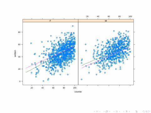
course
writ
ten
0
20
40
60
80
20 40 60 80 100
●
●
●●
●
●
●
●
●
●●
●●
●
●
●
●
●
●
●
●
●
●
●
●
●
●
●
●
●
●
●
●
● ●
●●
●
●
●
●
●
●
●
●
●
●
●
●
●
● ●
●
●●
●●
●
●
●
●
●
●
● ●
●
●
●
●
●
●
●
●
●
●
●
●
●
●●
●
●●
●●
●
●
●
●
●
●
●
●
●
●●
●
●
●●
●●
●
●
●
●
●
●
●
● ●
●
●
●
●
●
●
●
●●
●
●
●
●
●
●
●
●
●
●
●
●
●
●
●
●
●
●
●
●
●
●
●
●
●
●
●
●●
●
●
●
●
●
●
●
●
●
●
●
●
●
●
●●
●
●
●
●
●
●
● ●●
●
●
●
●
●
●
●
●
●
●
●
●
●
●
●
●
●
●●
● ●
●
●
●
● ●●
●
●
●
●
●
●
●
●
●
●
●
●
●●
●
●
● ●
●
●
●
●
●
●
●
●
●
●
●
●
●
●
●●
●
●
●
●
●●
●
●
●
●
●
●
●
● ●
●
●
●●
●
●
●
●●●
●
●
●
●
●
●
●
●
●
●
●
●
● ●
●
●
●
●
●
●
●
●
●
●
●
●
●●
●
●
●
●
●
●
●
● ●●
●
●
● ●
●
●
●
●
●
●
●
●
●
●
●
●
●●●
●
●
●
●
●
●
●
●
●●●
●
●●
●
●
●
●
●
●
●
●
●
●
●
●
●
●
●●
●
●
●
●
●●
●
● ●●●●
●
●
●
●
●
●
●
●
●
●
●
●
●
●
●
●
●
●
●
●●
●
●
●
●
●
●
●
●
●
●
●
●
●
●●
●
●
●●
●
●
●
●●
●
●
●
●
●●●
●
●
●
●●
●
●
●
●
●
●
●
●●●
●
●
●
●
●
●
●
●
● ●
●
●
●●
●
●
● ●
●●
●
●
●
●
●
●●●
●
●
●
●
●
●
●
●
●
●
●
●
●
●
●
●
●
●
●
●
●
●
●
●
●
●
●
●
●
●
●●
●
●
● ●
●
●
●
●
●
● ●
● ●
●
●
●
●
●
●
●
●
●
●
●
●
●
●
●
● ●
●
●
●●
●
●
●
● ●
●
●
●
●
●●
●
●
●
●
●
●
●●
●
●
●
●●
●
●
●
●
●●
●
●
●
●
●
●●
●
●
●
●
●
●
●
●
●
●
●
● ●
●
●
●
●●
●●
●
●
●
●
●
●
● ●
●
●
●
●
●
●
●
●
●
● ●
●
●
●
●●
●
●
● ●
●
●●
●
●
●
●
●
●
●
●
●
●
●
●
●
●
●
●
●
●
●
●
●
●
●
●
●
●
●
●
●
●
●
● ●
● ●
●
●
●
●
●
●
●●
●
●●
●
●
●
●
●●
●
●
●●
●
●●
●
●
●
●
●
●
●
●
●●●
●
●
●
●
●
●
●
●
●
●
● ●
●
●
●●
●
●
●
●
●
●
●
●●
●
●
●
●
●
● ●
●
●
●
●
●
●
●
●
●
●
●
●
●
●
●
●
●
●
●
●
●
●
●
●
●
●
●●
●
●
●
●
●
● ●
●
●
●
●
●
●
●
●
●
●
●
●●
●
●●
●
●
●
● ●
●
●
●
●
●
●
●
●
●
● ●
●
●
●
●
●
●
●●
●
●
●
●
●
●
●
●●
●
●
●
●●
●
●
●
●
●
●
●
●
●
●
●
●
●
●
●
●
●
●●
●
●
●
●
●
●
● ●
●
● ●
●
●
●
●
●
●
●
●
●●
●
●
●
●
●
●
●
●
●
●
●
●
●
●
●
●
●
●
●
●
●
●
●●
●
●
●
●
●
●
●
●
●
●
●
●
●
●
●
●● ●
●
●
●
●
●
●
●●
●
●●
●
●
●
●
●●
●
F
20 40 60 80 100
●
●
●
●●● ●
●
●
●
●
●●●
●●
●
●
●
●
●
●
●
●
●
●
●
●
●●
●
●
●
●
●
●
●
●
●
●
●
●
●
●
●
●
●
●
●
●
●
●
●
●
●
●
●
●
●
●
●
●
●
●
●
●
●
●
●
●
●
●
●
●
●
●
●●
●●
●
● ●
●
●
●
●
●
●
●
●
●
●●
●
●
●
●
●
●
●
●
●
●
●
●
●
●●
●
●● ●
●
● ●●
●
●
●
●
●
●
●
●
●
●
●
●●
●
●
●
●
●
●
●
●
●
●
●
● ●
●
●
●
●
●
●
●
●
●
●
●
●
●
●
●●
●
●
●
●
●
●
●
●
●
● ●
●●
●
●
●
●
●
●
●
●
●
●
●●
●
●●●
●
●
●
●
●
●
●
●
●
●
●
●
●
●●
●
●
●
●
●
●
●
●
●
●
●
●
●
●
●
●
●
●
●
●
●
●
●
●
●
●
●
●●
●
●
●
●
●
●●
●
●
●
●
●
●
●
●
●
● ●
●
●●
●
●
●
●
●
●
●
●
●
●
●
●
●
●
●
●
●
●
●
●
●
●
●
●
●
●
●
●
●
●●
●
●
●
●
●
●
●
●
●●
●
●
●
●
●
●
●
●
●
● ●
●
●
●
● ●
●
●
●
●
●
●
●
●
●
●
●
● ●
●
●
●
●
●●
●
●
●
●
●
●●
●
●
●●
●●
●
●
●●
●
●
●
●
●
●
●
●
●
●
●
●
●
●
●
●
●
●
●
●
●
● ●
●
●
●
●●
●
●
●
●
●
●
● ●
●
●
●
●
●
●●
●
●
●
●
●
●
●
● ●
●
●
●
●
●
●●
●●
●
●
●
●
● ●
●
●
●
●
●
●
●
●
●
●
●
●
●
●
●
●
●
●●
●
●●
●
●
●
●
●
●
●
● ●
●
●
●
●
●
●
●
●
●
●
● ●
●
●
●
●
●
●●
●
●
●
●
●
●
●
●
●
●
●
●
●
●
●
●
●
●
●
●
●
●
●
● ●
●
●
●
●
●
●
●
●
●
●
●
●
●●
●
●
●
●
●
●
●
●
●
●
●
●●
●
●
●
●
●
●
●
●
●●
●
●
●
●
●
●●
●
●
●
●
●
●
●
●
●
●
●
●●
●
●
●
●
●
●●
●
●
●
●
●
●●●
●
●
●●
●
●
●
●
●
●
●
●
●
●
●
●
●●
●
●
●
●
●
●
●
●
●
●
●
●
●
●
●
●
●
●
●
●
●
●
●
●
●
●●● ●
●
●
●
●
● ●
●●
●
●
●
●
●
●
●
● ●
M
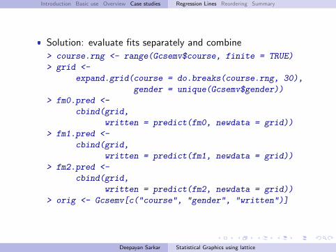
Introduction Basic use Overview Case studies Regression Lines Reordering Summary
� Solution: evaluate fits separately and combine
> course.rng <- range(Gcsemv$course, finite = TRUE)
> grid <-
expand.grid(course = do.breaks(course.rng, 30),
gender = unique(Gcsemv$gender))
> fm0.pred <-
cbind(grid,
written = predict(fm0, newdata = grid))
> fm1.pred <-
cbind(grid,
written = predict(fm1, newdata = grid))
> fm2.pred <-
cbind(grid,
written = predict(fm2, newdata = grid))
> orig <- Gcsemv[c("course", "gender", "written")]
Deepayan Sarkar Statistical Graphics using lattice
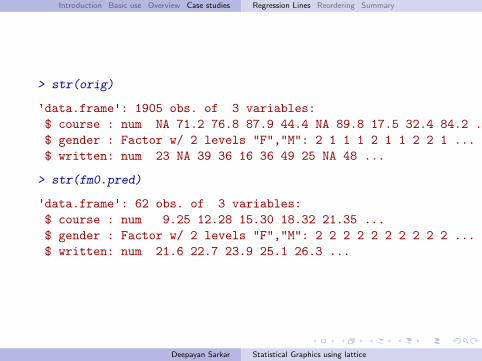
Introduction Basic use Overview Case studies Regression Lines Reordering Summary
> str(orig)
'data.frame': 1905 obs. of 3 variables:$ course : num NA 71.2 76.8 87.9 44.4 NA 89.8 17.5 32.4 84.2 ...$ gender : Factor w/ 2 levels "F","M": 2 1 1 1 2 1 1 2 2 1 ...$ written: num 23 NA 39 36 16 36 49 25 NA 48 ...
> str(fm0.pred)
'data.frame': 62 obs. of 3 variables:$ course : num 9.25 12.28 15.30 18.32 21.35 ...$ gender : Factor w/ 2 levels "F","M": 2 2 2 2 2 2 2 2 2 2 ...$ written: num 21.6 22.7 23.9 25.1 26.3 ...
Deepayan Sarkar Statistical Graphics using lattice
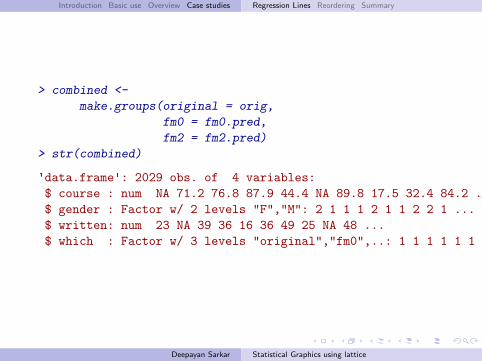
Introduction Basic use Overview Case studies Regression Lines Reordering Summary
> combined <-
make.groups(original = orig,
fm0 = fm0.pred,
fm2 = fm2.pred)
> str(combined)
'data.frame': 2029 obs. of 4 variables:$ course : num NA 71.2 76.8 87.9 44.4 NA 89.8 17.5 32.4 84.2 ...$ gender : Factor w/ 2 levels "F","M": 2 1 1 1 2 1 1 2 2 1 ...$ written: num 23 NA 39 36 16 36 49 25 NA 48 ...$ which : Factor w/ 3 levels "original","fm0",..: 1 1 1 1 1 1 1 1 1 1 ...
Deepayan Sarkar Statistical Graphics using lattice
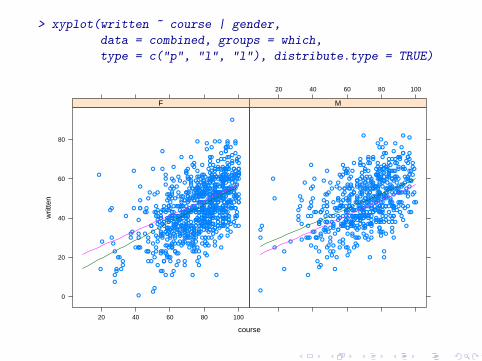
> xyplot(written ~ course | gender,
data = combined, groups = which,
type = c("p", "l", "l"), distribute.type = TRUE)
course
writ
ten
0
20
40
60
80
20 40 60 80 100
●
●
●●
●
●
●
●
●
●●
●●
●
●
●
●
●
●
●
●
●
●
●
●
●
●
●
●
●
●
●
●
● ●
●●
●
●
●
●
●
●
●
●
●
●
●
●
●
● ●
●
●●
●●
●
●
●
●
●
●
● ●
●
●
●
●
●
●
●
●
●
●
●
●
●
●●
●
●●
●●
●
●
●
●
●
●
●
●
●
●●
●
●
●●
●●
●
●
●
●
●
●
●
● ●
●
●
●
●
●
●
●
●●
●
●
●
●
●
●
●
●
●
●
●
●
●
●
●
●
●
●
●
●
●
●
●
●
●
●
●
●●
●
●
●
●
●
●
●
●
●
●
●
●
●
●
●●
●
●
●
●
●
●
● ●●
●
●
●
●
●
●
●
●
●
●
●
●
●
●
●
●
●
●●
● ●
●
●
●
● ●●
●
●
●
●
●
●
●
●
●
●
●
●
●●
●
●
● ●
●
●
●
●
●
●
●
●
●
●
●
●
●
●
●●
●
●
●
●
●●
●
●
●
●
●
●
●
● ●
●
●
●●
●
●
●
●●●
●
●
●
●
●
●
●
●
●
●
●
●
● ●
●
●
●
●
●
●
●
●
●
●
●
●
●●
●
●
●
●
●
●
●
● ●●
●
●
● ●
●
●
●
●
●
●
●
●
●
●
●
●
●●●
●
●
●
●
●
●
●
●
●●●
●
●●
●
●
●
●
●
●
●
●
●
●
●
●
●
●
●●
●
●
●
●
●●
●
● ●●●●
●
●
●
●
●
●
●
●
●
●
●
●
●
●
●
●
●
●
●
●●
●
●
●
●
●
●
●
●
●
●
●
●
●
●●
●
●
●●
●
●
●
●●
●
●
●
●
●●●
●
●
●
●●
●
●
●
●
●
●
●
●●●
●
●
●
●
●
●
●
●
● ●
●
●
●●
●
●
● ●
●●
●
●
●
●
●
●●●
●
●
●
●
●
●
●
●
●
●
●
●
●
●
●
●
●
●
●
●
●
●
●
●
●
●
●
●
●
●
●●
●
●
● ●
●
●
●
●
●
● ●
● ●
●
●
●
●
●
●
●
●
●
●
●
●
●
●
●
● ●
●
●
●●
●
●
●
● ●
●
●
●
●
●●
●
●
●
●
●
●
●●
●
●
●
●●
●
●
●
●
●●
●
●
●
●
●
●●
●
●
●
●
●
●
●
●
●
●
●
● ●
●
●
●
●●
●●
●
●
●
●
●
●
● ●
●
●
●
●
●
●
●
●
●
● ●
●
●
●
●●
●
●
● ●
●
●●
●
●
●
●
●
●
●
●
●
●
●
●
●
●
●
●
●
●
●
●
●
●
●
●
●
●
●
●
●
●
●
● ●
● ●
●
●
●
●
●
●
●●
●
●●
●
●
●
●
●●
●
●
●●
●
●●
●
●
●
●
●
●
●
●
●●●
●
●
●
●
●
●
●
●
●
●
● ●
●
●
●●
●
●
●
●
●
●
●
●●
●
●
●
●
●
● ●
●
●
●
●
●
●
●
●
●
●
●
●
●
●
●
●
●
●
●
●
●
●
●
●
●
●
●●
●
●
●
●
●
● ●
●
●
●
●
●
●
●
●
●
●
●
●●
●
●●
●
●
●
● ●
●
●
●
●
●
●
●
●
●
● ●
●
●
●
●
●
●
●●
●
●
●
●
●
●
●
●●
●
●
●
●●
●
●
●
●
●
●
●
●
●
●
●
●
●
●
●
●
●
●●
●
●
●
●
●
●
● ●
●
● ●
●
●
●
●
●
●
●
●
●●
●
●
●
●
●
●
●
●
●
●
●
●
●
●
●
●
●
●
●
●
●
●
●●
●
●
●
●
●
●
●
●
●
●
●
●
●
●
●
●● ●
●
●
●
●
●
●
●●
●
●●
●
●
●
●
●●
●
F
20 40 60 80 100
●
●
●
●●● ●
●
●
●
●
●●●
●●
●
●
●
●
●
●
●
●
●
●
●
●
●●
●
●
●
●
●
●
●
●
●
●
●
●
●
●
●
●
●
●
●
●
●
●
●
●
●
●
●
●
●
●
●
●
●
●
●
●
●
●
●
●
●
●
●
●
●
●
●●
●●
●
● ●
●
●
●
●
●
●
●
●
●
●●
●
●
●
●
●
●
●
●
●
●
●
●
●
●●
●
●● ●
●
● ●●
●
●
●
●
●
●
●
●
●
●
●
●●
●
●
●
●
●
●
●
●
●
●
●
● ●
●
●
●
●
●
●
●
●
●
●
●
●
●
●
●●
●
●
●
●
●
●
●
●
●
● ●
●●
●
●
●
●
●
●
●
●
●
●
●●
●
●●●
●
●
●
●
●
●
●
●
●
●
●
●
●
●●
●
●
●
●
●
●
●
●
●
●
●
●
●
●
●
●
●
●
●
●
●
●
●
●
●
●
●
●●
●
●
●
●
●
●●
●
●
●
●
●
●
●
●
●
● ●
●
●●
●
●
●
●
●
●
●
●
●
●
●
●
●
●
●
●
●
●
●
●
●
●
●
●
●
●
●
●
●
●●
●
●
●
●
●
●
●
●
●●
●
●
●
●
●
●
●
●
●
● ●
●
●
●
● ●
●
●
●
●
●
●
●
●
●
●
●
● ●
●
●
●
●
●●
●
●
●
●
●
●●
●
●
●●
●●
●
●
●●
●
●
●
●
●
●
●
●
●
●
●
●
●
●
●
●
●
●
●
●
●
● ●
●
●
●
●●
●
●
●
●
●
●
● ●
●
●
●
●
●
●●
●
●
●
●
●
●
●
● ●
●
●
●
●
●
●●
●●
●
●
●
●
● ●
●
●
●
●
●
●
●
●
●
●
●
●
●
●
●
●
●
●●
●
●●
●
●
●
●
●
●
●
● ●
●
●
●
●
●
●
●
●
●
●
● ●
●
●
●
●
●
●●
●
●
●
●
●
●
●
●
●
●
●
●
●
●
●
●
●
●
●
●
●
●
●
● ●
●
●
●
●
●
●
●
●
●
●
●
●
●●
●
●
●
●
●
●
●
●
●
●
●
●●
●
●
●
●
●
●
●
●
●●
●
●
●
●
●
●●
●
●
●
●
●
●
●
●
●
●
●
●●
●
●
●
●
●
●●
●
●
●
●
●
●●●
●
●
●●
●
●
●
●
●
●
●
●
●
●
●
●
●●
●
●
●
●
●
●
●
●
●
●
●
●
●
●
●
●
●
●
●
●
●
●
●
●
●
●●● ●
●
●
●
●
● ●
●●
●
●
●
●
●
●
●
● ●
M
Introduction Basic use Overview Case studies Regression Lines Reordering Summary
Reordering factor levels
� Levels of categorical variables often have no intrinsic order
� The default in factor() is to use sort(unique(x))� Implies alphabetical order for factors converted from character
� Usually irrelevant in analyses
� Can strongly affect impact in a graphical display
Deepayan Sarkar Statistical Graphics using lattice
Introduction Basic use Overview Case studies Regression Lines Reordering Summary
Example
� Population density in US states in 1975
> state <-
data.frame(name = state.name,
region = state.region,
state.x77)
> state$Density <- with(state, Population / Area)
> dotplot(name ~ Density, state)
> dotplot(name ~ Density, state,
scales = list(x = list(log = TRUE)))
Deepayan Sarkar Statistical Graphics using lattice
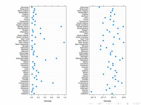
Density
AlabamaAlaska
ArizonaArkansasCaliforniaColorado
ConnecticutDelaware
FloridaGeorgia
HawaiiIdahoIllinois
IndianaIowa
KansasKentuckyLouisiana
MaineMaryland
MassachusettsMichigan
MinnesotaMississippi
MissouriMontana
NebraskaNevada
New HampshireNew JerseyNew Mexico
New YorkNorth Carolina
North DakotaOhio
OklahomaOregon
PennsylvaniaRhode Island
South CarolinaSouth Dakota
TennesseeTexasUtah
VermontVirginia
WashingtonWest Virginia
WisconsinWyoming
0.0 0.2 0.4 0.6 0.8 1.0
●
●
●
●
●
●
●
●
●
●
●
●
●
●
●
●
●
●
●
●
●
●
●
●
●
●
●
●
●
●
●
●
●
●
●
●
●
●
●
●
●
●
●
●
●
●
●
●
●
●
Density
AlabamaAlaska
ArizonaArkansasCaliforniaColorado
ConnecticutDelaware
FloridaGeorgia
HawaiiIdahoIllinois
IndianaIowa
KansasKentuckyLouisiana
MaineMaryland
MassachusettsMichigan
MinnesotaMississippi
MissouriMontana
NebraskaNevada
New HampshireNew JerseyNew Mexico
New YorkNorth Carolina
North DakotaOhio
OklahomaOregon
PennsylvaniaRhode Island
South CarolinaSouth Dakota
TennesseeTexasUtah
VermontVirginia
WashingtonWest Virginia
WisconsinWyoming
10^−3 10^−2 10^−1 10^0
●
●
●
●
●
●
●
●
●
●
●
●
●
●
●
●
●
●
●
●
●
●
●
●
●
●
●
●
●
●
●
●
●
●
●
●
●
●
●
●
●
●
●
●
●
●
●
●
●
●
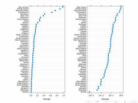
Density
AlaskaWyomingMontanaNevada
South DakotaNorth DakotaNew Mexico
IdahoUtah
ArizonaNebraska
OregonColorado
KansasMaine
OklahomaArkansas
TexasMinnesotaMississippi
VermontIowa
WashingtonMissouriAlabama
West VirginiaWisconsinLouisiana
GeorgiaKentucky
New HampshireSouth Carolina
TennesseeNorth Carolina
VirginiaHawaii
CaliforniaIndianaFlorida
MichiganIllinois
OhioPennsylvania
DelawareNew YorkMaryland
ConnecticutMassachusetts
Rhode IslandNew Jersey
0.0 0.2 0.4 0.6 0.8 1.0
●
●
●
●
●
●
●
●
●
●
●
●
●
●
●
●
●
●
●
●
●
●
●
●
●
●
●
●
●
●
●
●
●
●
●
●
●
●
●
●
●
●
●
●
●
●
●
●
●
●
Density
AlaskaWyomingMontanaNevada
South DakotaNorth DakotaNew Mexico
IdahoUtah
ArizonaNebraska
OregonColorado
KansasMaine
OklahomaArkansas
TexasMinnesotaMississippi
VermontIowa
WashingtonMissouriAlabama
West VirginiaWisconsinLouisiana
GeorgiaKentucky
New HampshireSouth Carolina
TennesseeNorth Carolina
VirginiaHawaii
CaliforniaIndianaFlorida
MichiganIllinois
OhioPennsylvania
DelawareNew YorkMaryland
ConnecticutMassachusetts
Rhode IslandNew Jersey
10^−3 10^−2 10^−1 10^0
●
●
●
●
●
●
●
●
●
●
●
●
●
●
●
●
●
●
●
●
●
●
●
●
●
●
●
●
●
●
●
●
●
●
●
●
●
●
●
●
●
●
●
●
●
●
●
●
●
●
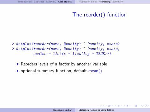
Introduction Basic use Overview Case studies Regression Lines Reordering Summary
The reorder() function
> dotplot(reorder(name, Density) ~ Density, state)
> dotplot(reorder(name, Density) ~ Density, state,
scales = list(x = list(log = TRUE)))
� Reorders levels of a factor by another variable
� optional summary function, default mean()
Deepayan Sarkar Statistical Graphics using lattice
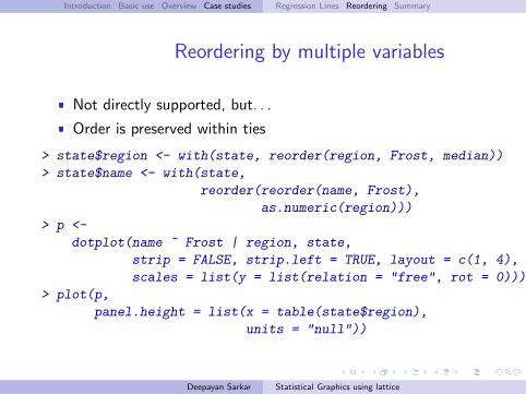
Introduction Basic use Overview Case studies Regression Lines Reordering Summary
Reordering by multiple variables
� Not directly supported, but. . .
� Order is preserved within ties
> state$region <- with(state, reorder(region, Frost, median))
> state$name <- with(state,
reorder(reorder(name, Frost),
as.numeric(region)))
> p <-
dotplot(name ~ Frost | region, state,
strip = FALSE, strip.left = TRUE, layout = c(1, 4),
scales = list(y = list(relation = "free", rot = 0)))
> plot(p,
panel.height = list(x = table(state$region),
units = "null"))
Deepayan Sarkar Statistical Graphics using lattice
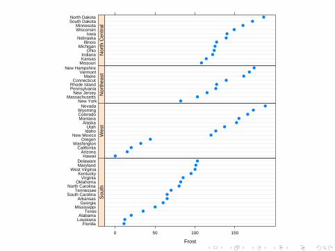
Frost
FloridaLouisianaAlabama
TexasMississippi
GeorgiaArkansas
South CarolinaTennessee
North CarolinaOklahoma
VirginiaKentucky
West VirginiaMarylandDelaware
0 50 100 150
●
●
●
●
●
●
●
●
●
●
●
●
●
●
●
●
Sou
th
HawaiiArizona
CaliforniaWashington
OregonNew Mexico
IdahoUtah
AlaskaMontanaColoradoWyoming
Nevada
●
●
●
●
●
●
●
●
●
●
●
●
●
Wes
tNew York
MassachusettsNew Jersey
PennsylvaniaRhode Island
ConnecticutMaine
VermontNew Hampshire
●
●
●
●
●
●
●
●
●
Nor
thea
st
MissouriKansasIndiana
OhioMichigan
IllinoisNebraska
IowaWisconsinMinnesota
South DakotaNorth Dakota
●
●
●
●
●
●
●
●
●
●
●
●
Nor
th C
entr
al
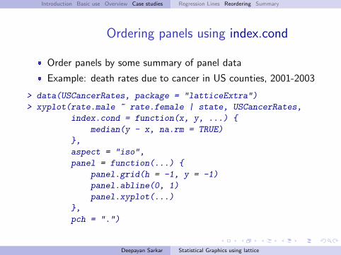
Introduction Basic use Overview Case studies Regression Lines Reordering Summary
Ordering panels using index.cond
� Order panels by some summary of panel data
� Example: death rates due to cancer in US counties, 2001-2003
> data(USCancerRates, package = "latticeExtra")
> xyplot(rate.male ~ rate.female | state, USCancerRates,
index.cond = function(x, y, ...) {
median(y - x, na.rm = TRUE)
},
aspect = "iso",
panel = function(...) {
panel.grid(h = -1, y = -1)
panel.abline(0, 1)
panel.xyplot(...)
},
pch = ".")
Deepayan Sarkar Statistical Graphics using lattice
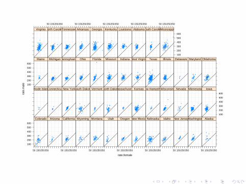
rate.female
rate
.mal
e
100
200
300
400
500
600
50 150250350
Colorado Arizona
50 150250350
California Wyoming
50 150250350
Montana Utah
50 150250350
Oregon New Mexico
50 150250350
Nebraska Idaho
50 150250350
New JerseyWashington
50 150250350
Alaska
Rhode IslandConnecticut New YorkSouth DakotaVermontNorth DakotaMassachusettsKansasNew HampshireWisconsin Nevada Minnesota
100
200
300
400
500
600
Iowa
100
200
300
400
500
600
Maine MichiganPennsylvania Ohio Florida Missouri Indiana West Virginia Texas Illinois Delaware Maryland Oklahoma
Virginia
50 150250350
North CarolinaTennessee
50 150250350
Arkansas Georgia
50 150250350
Kentucky Louisiana
50 150250350
AlabamaSouth Carolina
50 150250350
100
200
300
400
500
600
Mississippi
Introduction Basic use Overview Case studies Regression Lines Reordering Summary
Take home message
� Panel functions provide finest level of control
� Built-in panel functions are also powerful� Easily taken advantage of using argument passing� Requires knowledge of arguments (read documentation!)� Special function panel.superpose() useful for grouping
� Several useful functions make life a little simpler� reorder(), make.groups(), etc.
Deepayan Sarkar Statistical Graphics using lattice